
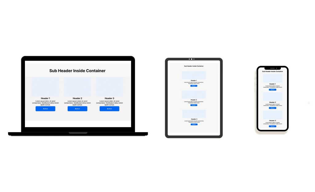
I partnered with a development team to build a comprehensive design system that would streamline wireframing and prototyping across dozens of client projects at a fast-paced digital agency. The challenge was unique: create a flexible, brand-agnostic component library that could adapt to clients spanning healthcare, finance, retail, and technology sectors while maintaining consistency in our design process. This system needed to work seamlessly across both Adobe XD and Figma, accommodating different designer preferences and client requirements while ensuring responsive behavior across desktop and mobile breakpoints.
The existing workflow relied on inconsistent wireframes created ad-hoc by developers with no documented standards or reusable components. This led to duplicated effort, inconsistent client presentations, and significant time lost recreating basic UI elements for each new project. Additionally, the agency's previous Adobe XD file lacked the responsive design capabilities needed for modern multi-device prototyping, making it difficult to demonstrate how designs would adapt across screen sizes during client reviews.
I aimed to create the following in Adobe XD, then do the same in Figma with more responsive components with auto-layout:
My approach focused on creating a modular system of low to medium fidelity components that could be quickly customized with client-specific branding while maintaining strong information architecture and interaction patterns. By establishing clear hierarchy, spacing, and component variants, I enabled the team to move from concept to clickable prototype in a fraction of the time.
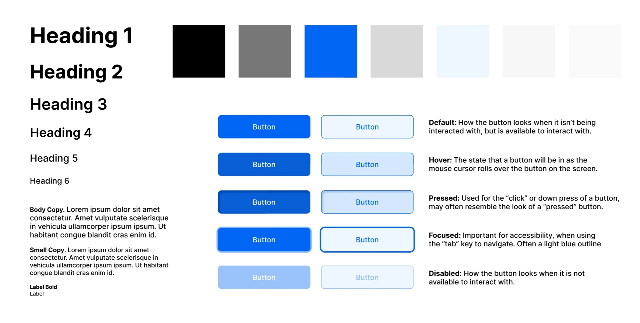
Before building the component library, I conducted extensive research into industry-standard design systems and accessibility guidelines to ensure our foundation would be both robust and compliant. I started with a deep analysis of WCAG 2.1 standards, focusing on contrast ratios, touch target sizing, and keyboard navigation patterns that would need to be baked into our base components from the start.
I also studied Apple's Human Interface Guidelines and Google's Material Design system to understand how leading tech companies approach responsive component behavior, spacing systems, and interaction patterns across devices. Material Design's elevation system and grid structures informed how I built hierarchy into our components, while Apple's HIG provided valuable insights into touch targets, gesture patterns, and mobile-first thinking that translated directly into our wireframe specifications.
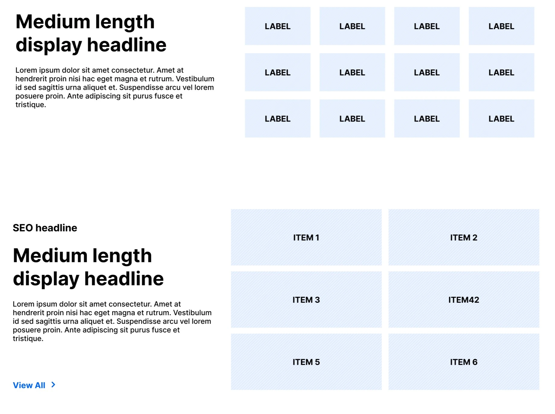
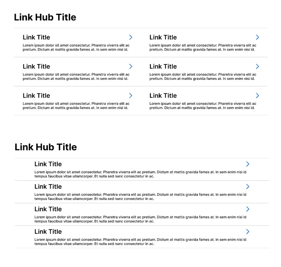
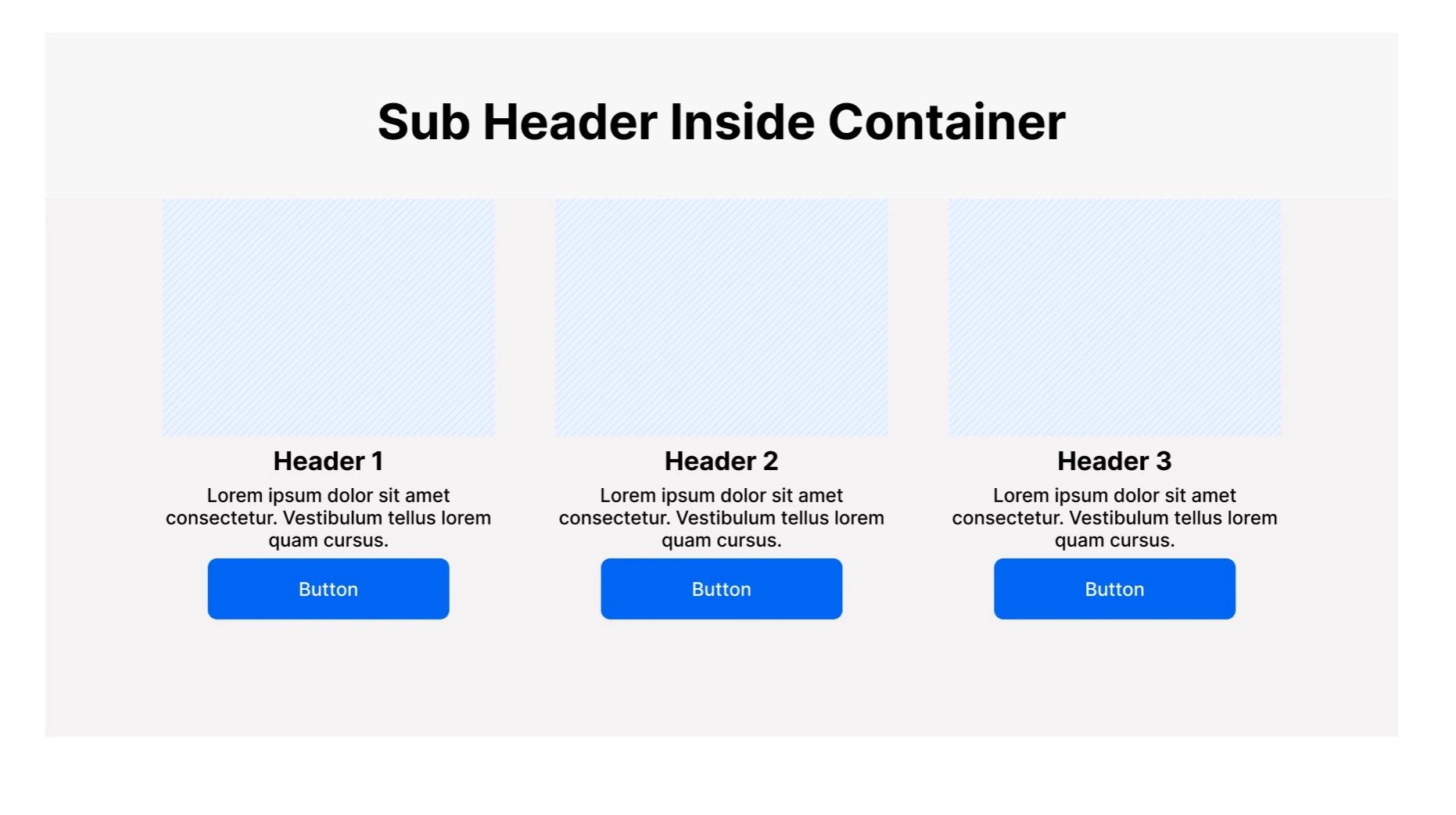
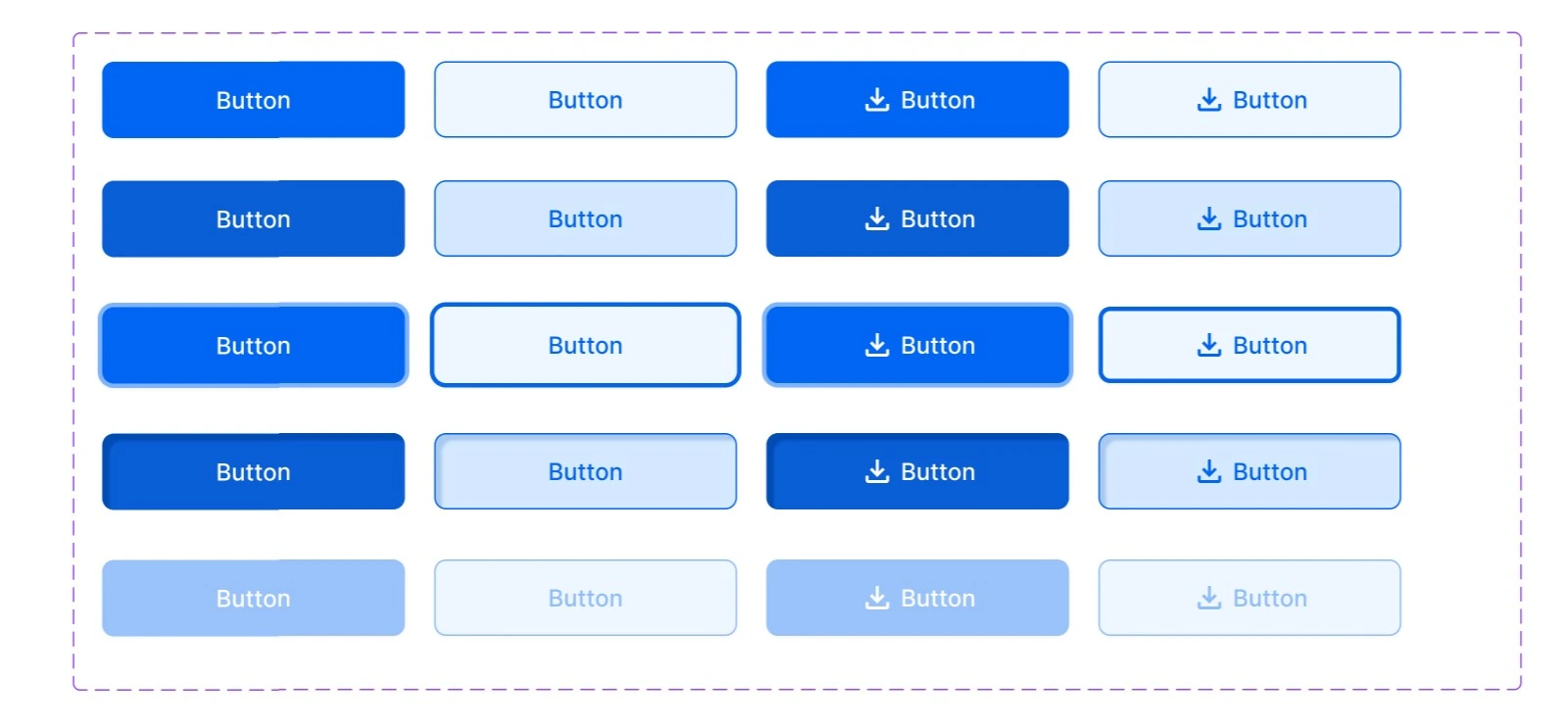
All components were created to be fully responsive in Figma Auto layout and resize for different screen sizes.
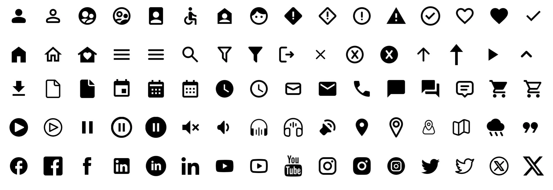
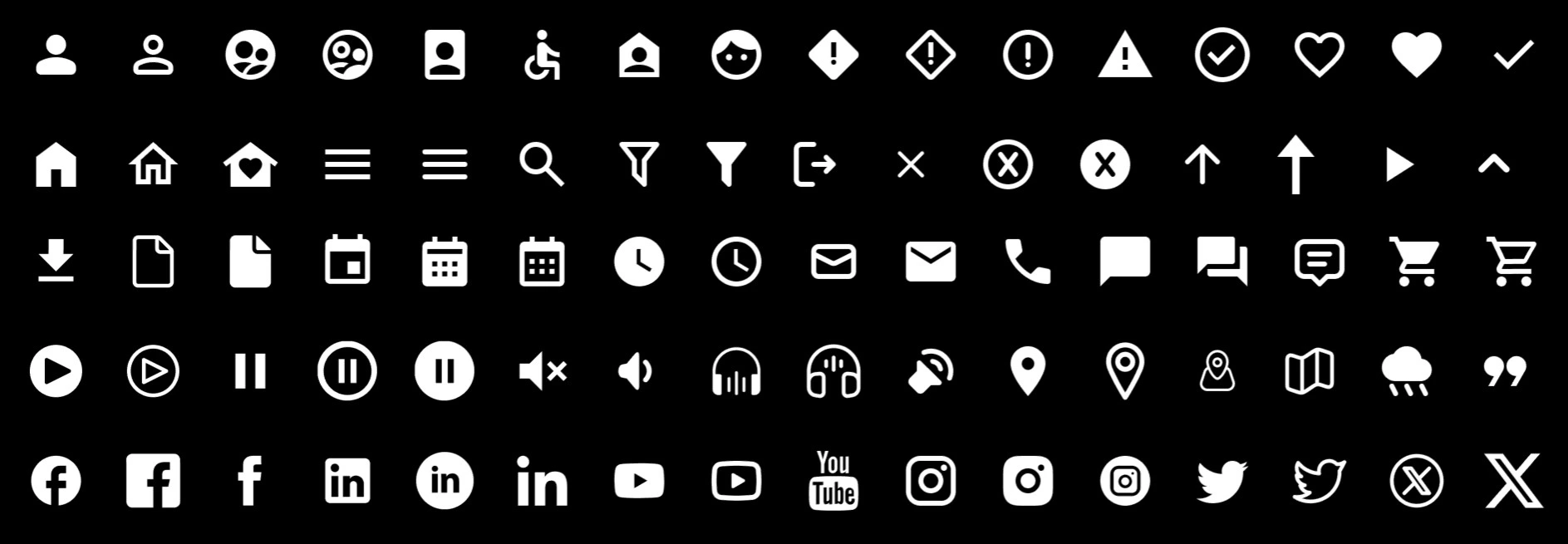
Components with different variants were coded to toggle on and off different elements within the component.
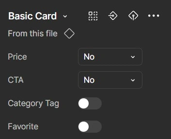
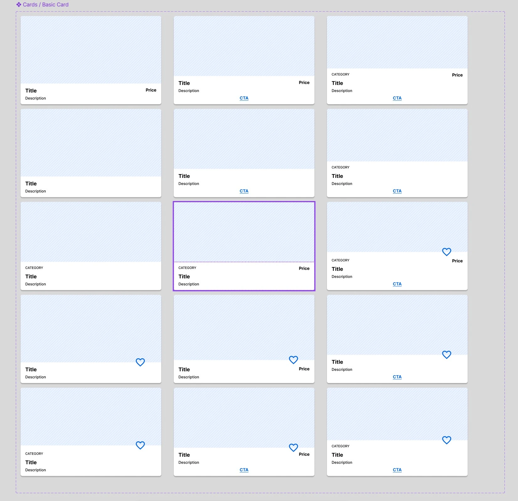
Interactive components also were designed to include hover states, tab focus states, inactive states, and alternative designs.