I took on this personal design exercise to explore how App Store creative optimization could transform user perception and drive conversion for TurboScan Pro, a document scanning app. My goal was to create two distinct variations of App Store screenshots that applied best practices in visual hierarchy, benefit-driven messaging, and compositional design based on competitive analysis of top-performing apps like Adobe Scan, Microsoft Lens, and CamScanner. Each variation needed to communicate the app's core value proposition within the first few seconds of browsing while maintaining thumbnail legibility and authentic product representation.
The project challenged me to develop contrasting creative directions: one using bold, high-contrast backgrounds with benefit-focused headlines to immediately grab attention, and another taking a cleaner, product-forward approach with minimal text overlay.
*This was an independent design exercise based on publicly available information and is not affiliated with TurboScan Pro.
Independent Practice Project - not associated with TurboScan (all rights reserved)
Competitive Audit: I planned a comprehensive competitive audit of leading document scanning apps to identify what drives conversion in the App Store. My research would focus on analyzing presentations from Adobe Scan, Microsoft Lens, CamScanner, and other top-performing competitors to evaluate their approach to visual hierarchy, messaging strategy, screenshot composition, and feature prioritization.
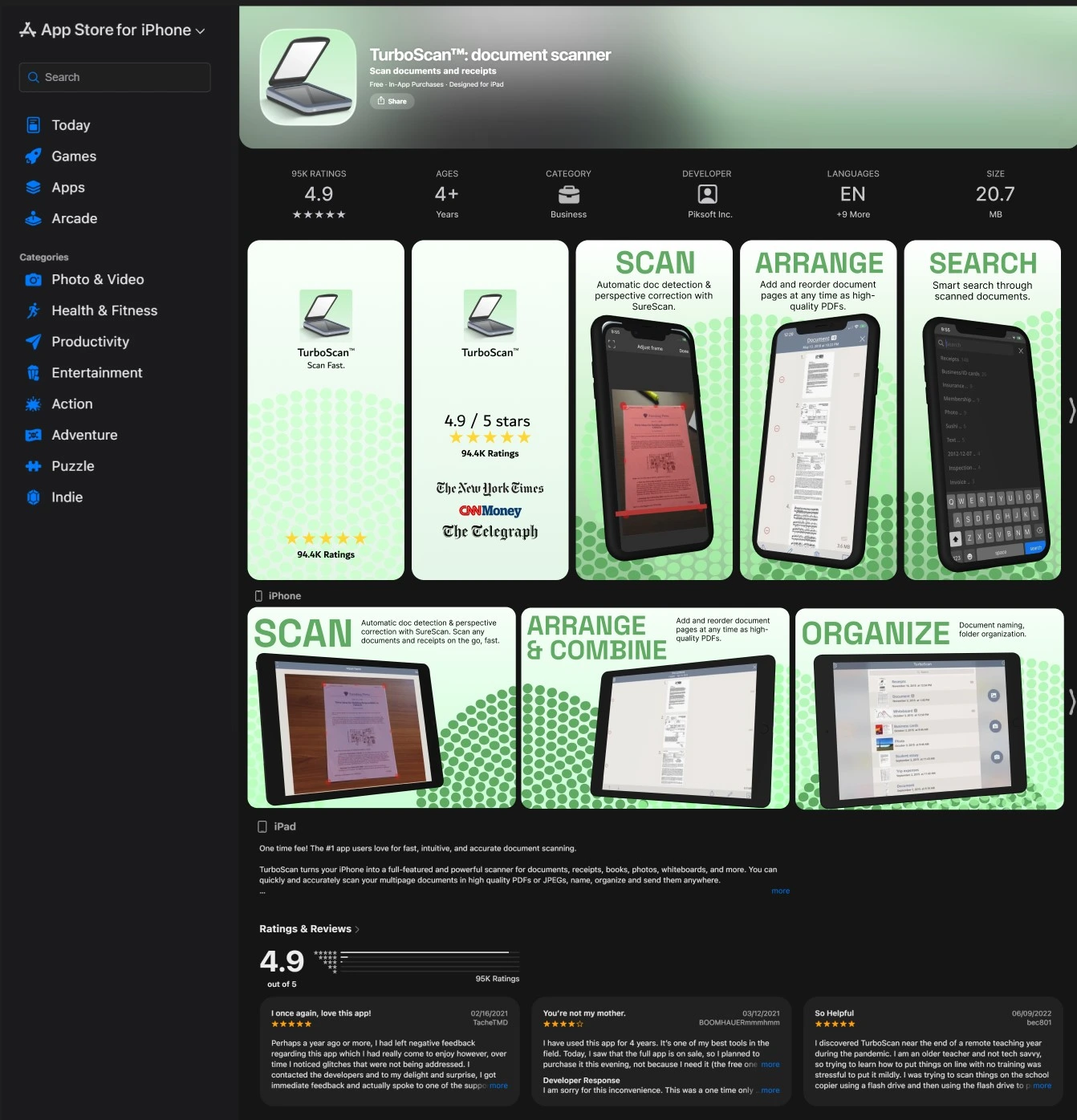
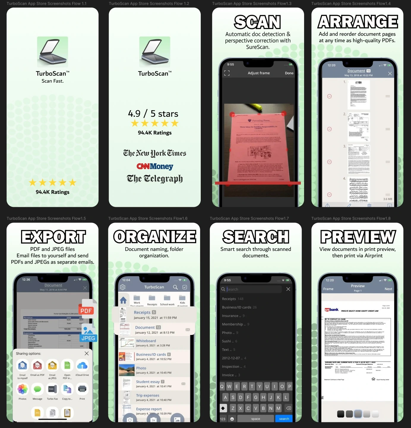
High-fidelity mockups: From these insights, I would move into high fidelity design exploration to create two distinct creative directions that reimagined TurboScan Pro's App Store presence. Each variation would apply current ASO best practices while testing different hypotheses about what resonates with the target audience.
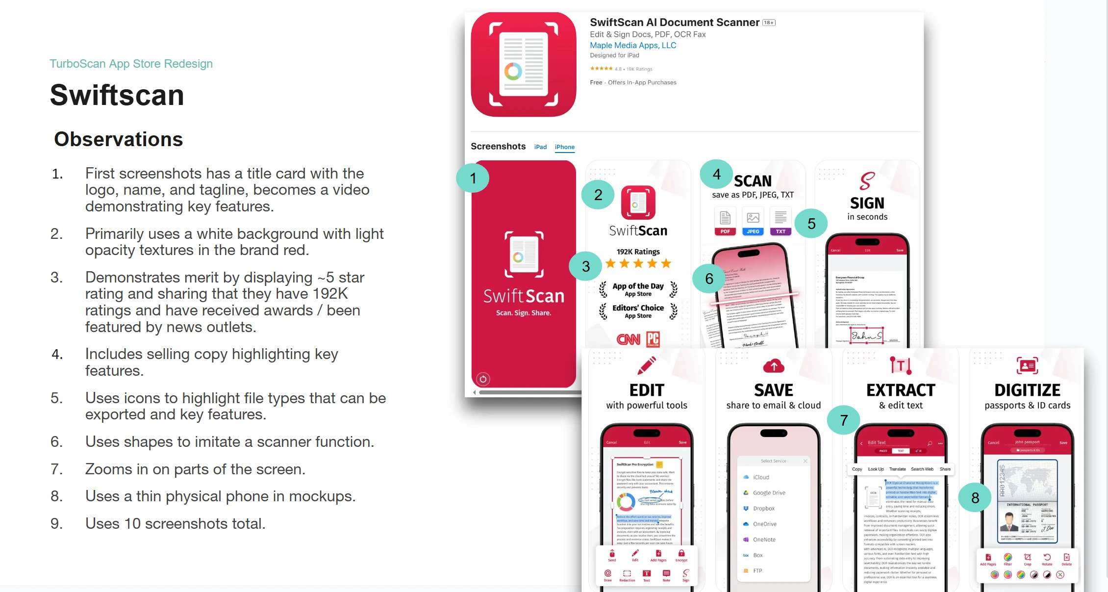
I completed a competitive audit of top-performing scanning apps including Docly, Scanner Pro, Scanner Hero, iScanner, and SwiftScan to identify conversion-driving patterns and design opportunities:
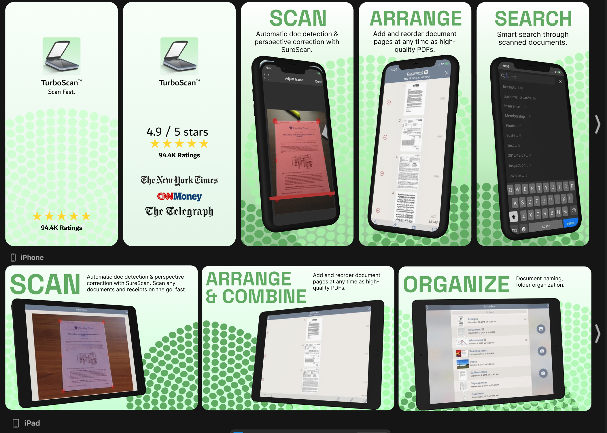
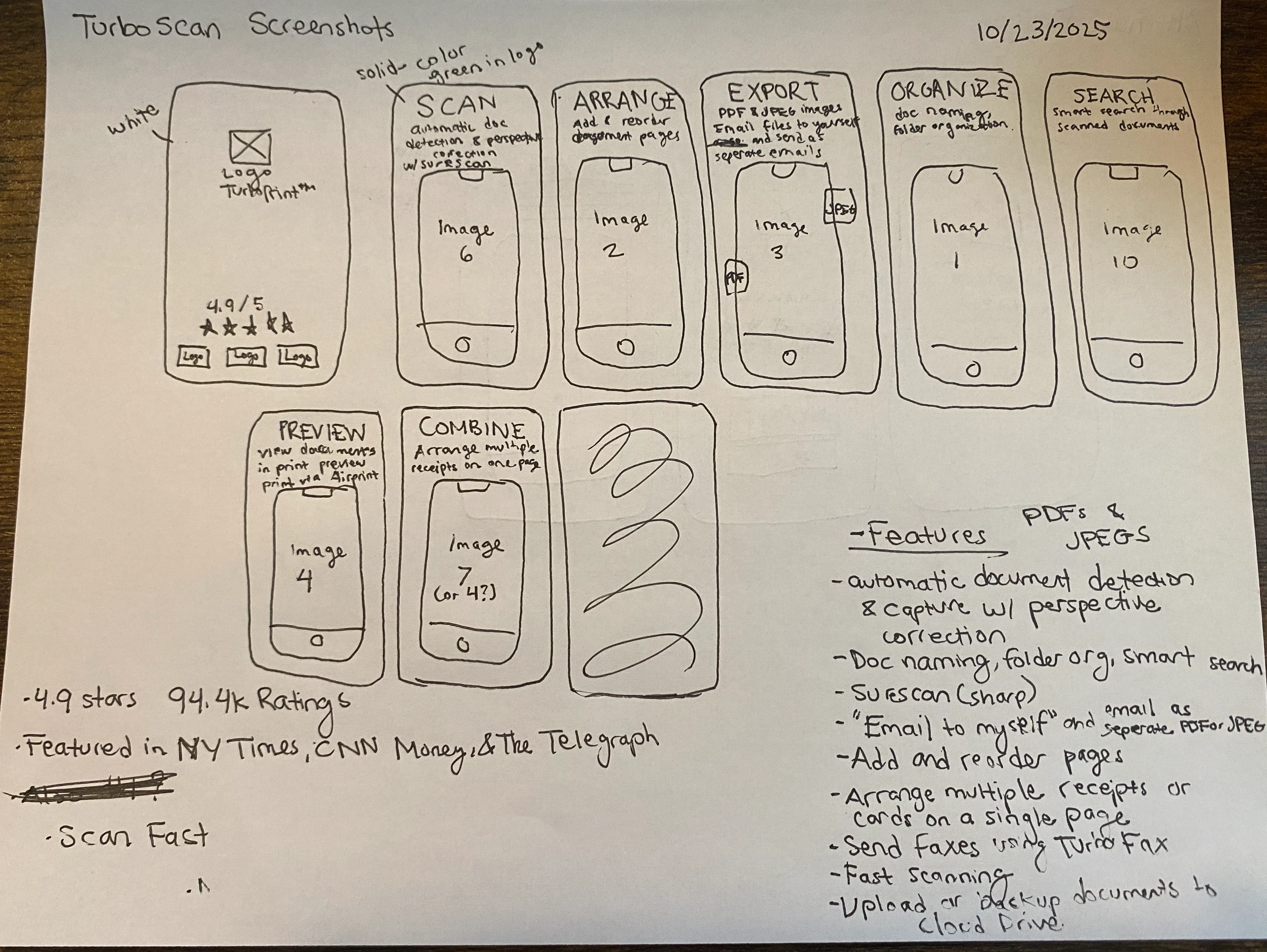
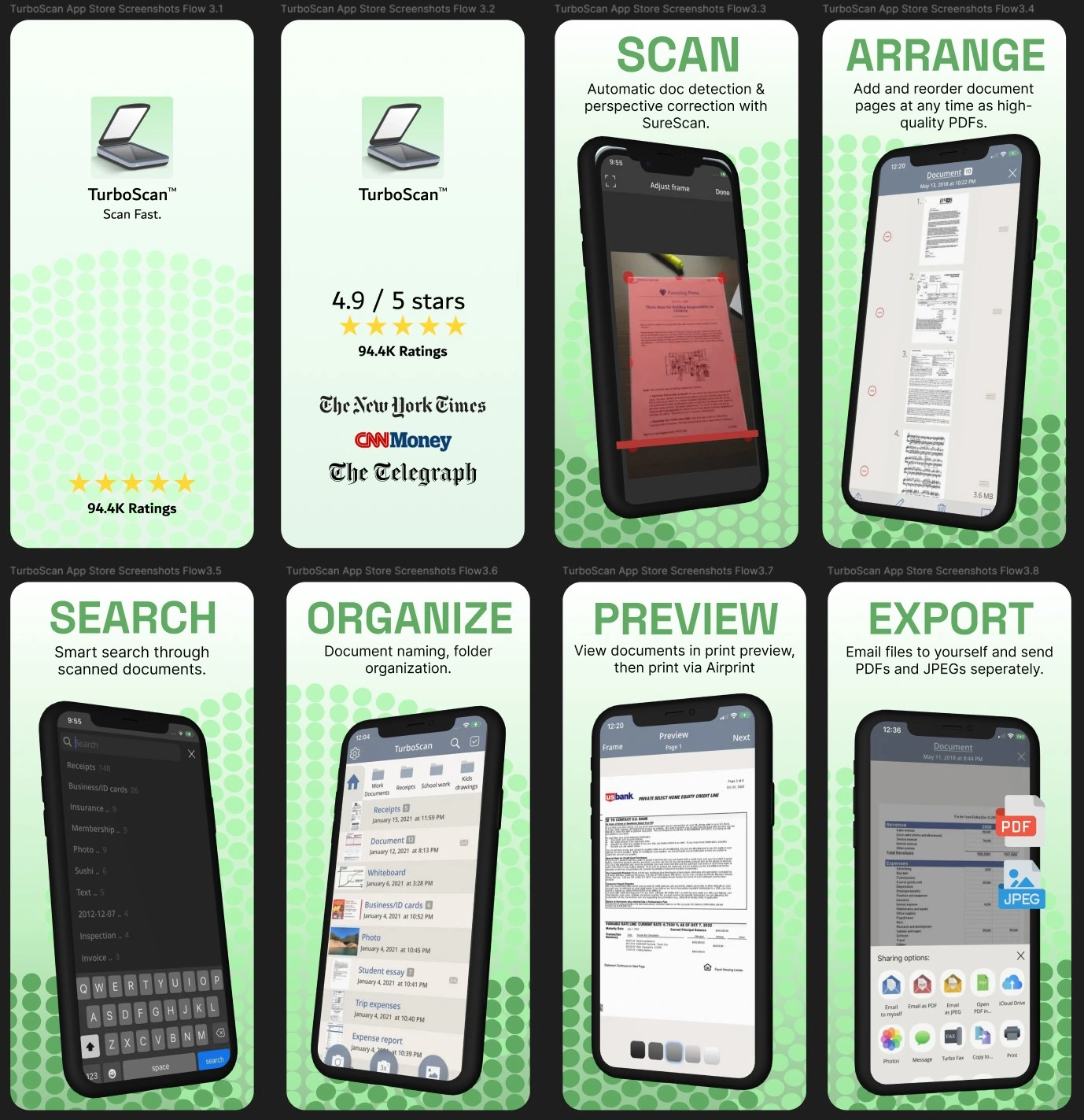
I created low fidelity paper sketches to explore layout options based on competitive audit findings and ASO best practices. These sketches allowed me to quickly iterate on composition, information hierarchy, and visual flow before committing to high fidelity design work.
Copy Strategy:
Layout Structure:
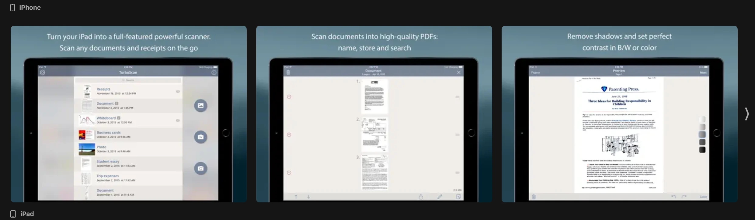
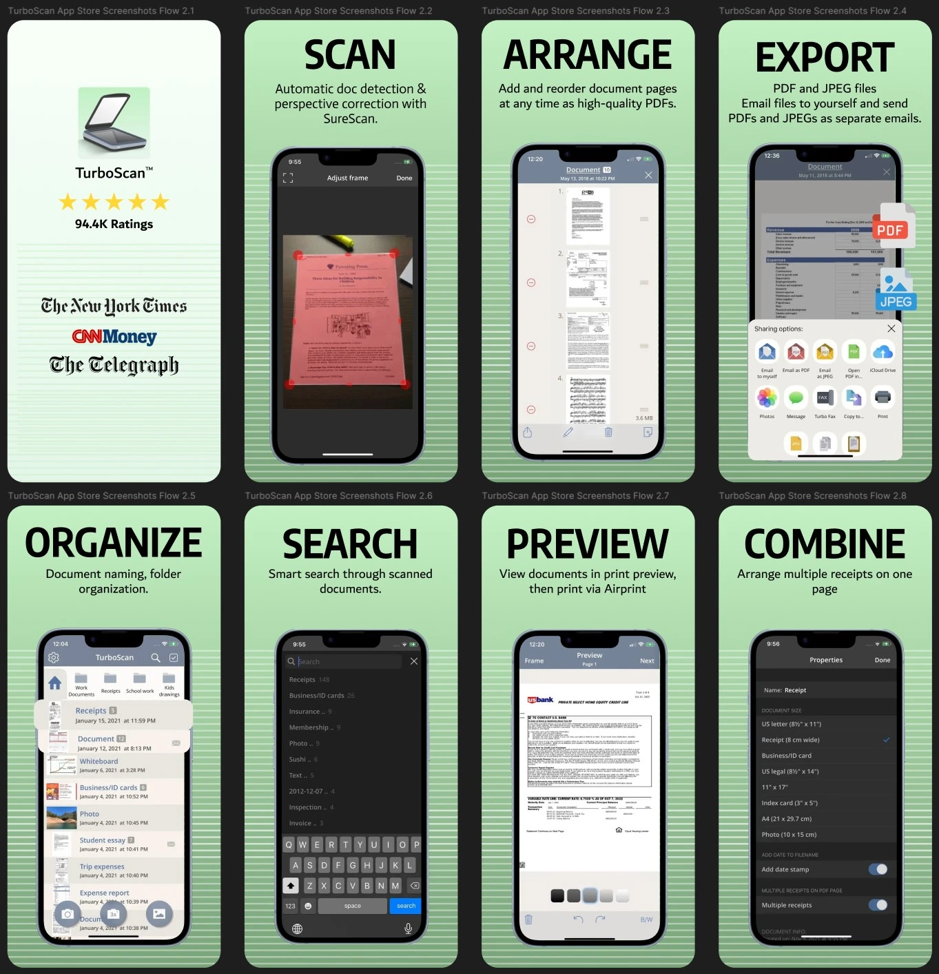
Alternate Version:
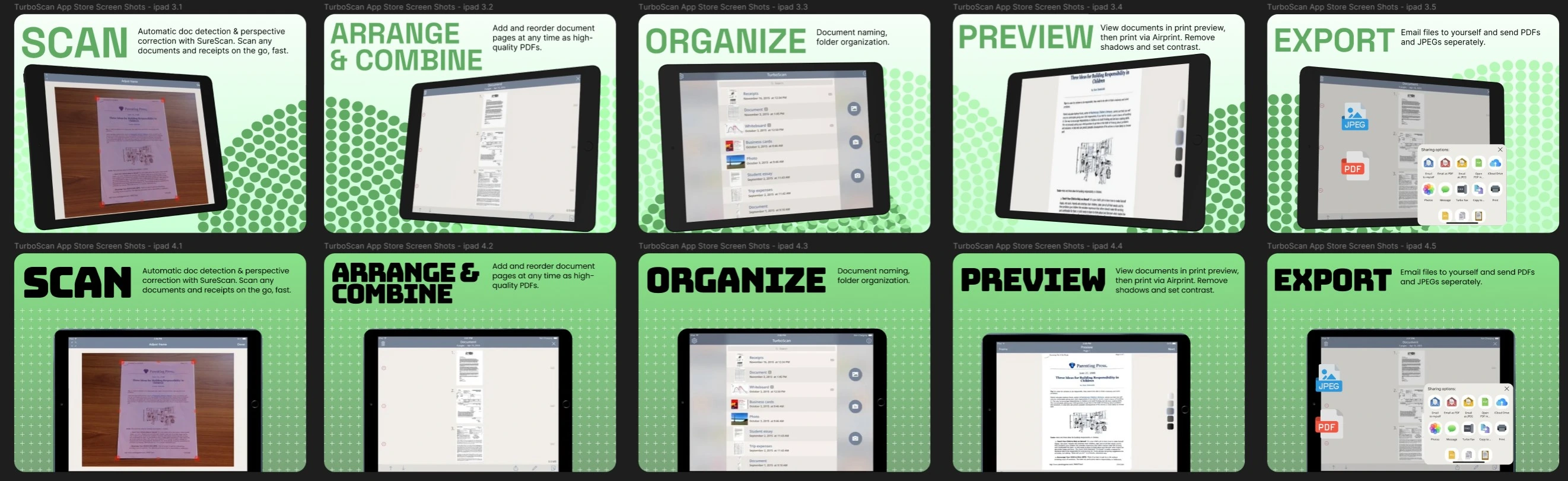
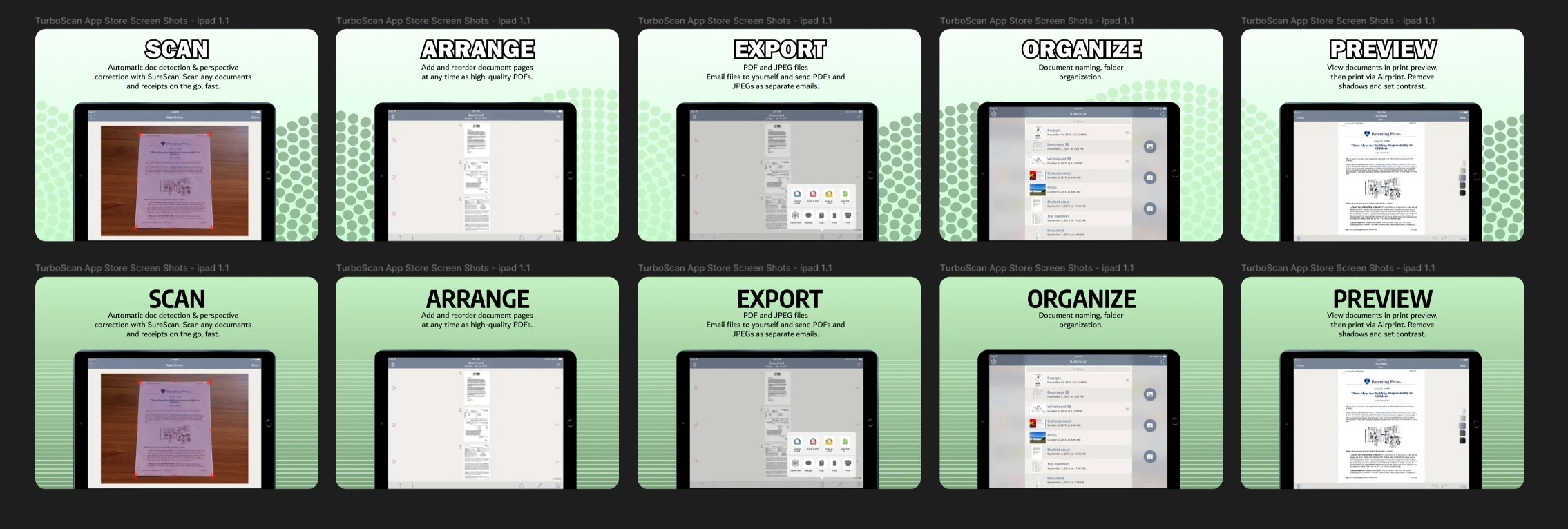
iPad Designs:
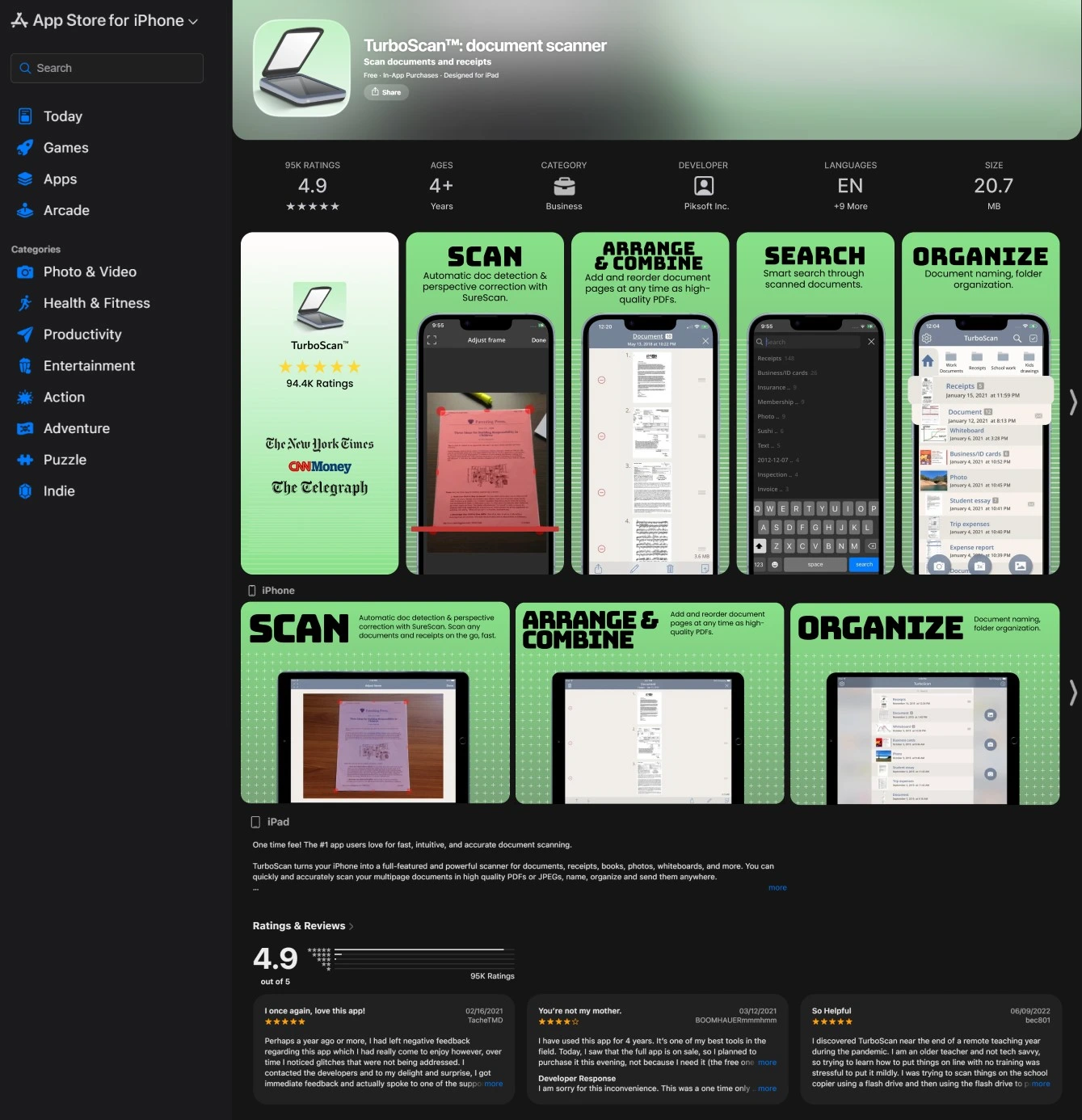
After completing the first version of high fidelity screenshots, I received feedback that while the designs successfully matched competitor quality, they didn't fully embrace emerging 2025 design trends or optimize the narrative flow. The visual treatment felt safe and the screenshot sequence didn't effectively guide users through a logical product story. I used this feedback to push the design further and created a second version that incorporated current creative directions dominating the App Store in 2025.
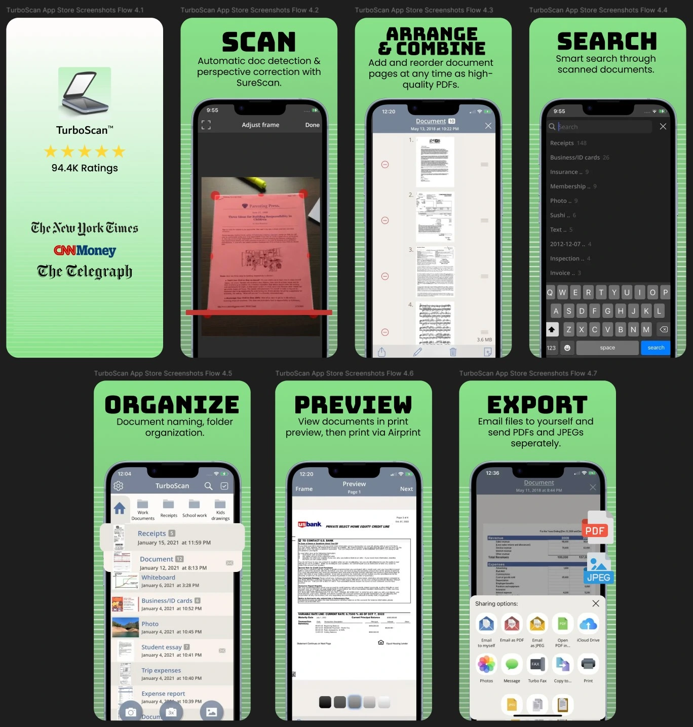
Key Changes in Versions 3 and 4:
Alternate Version:
iPad Versions: