Making a top 100 scoring time loop space tower defense game in four days for GMTK 2025

Product Design

Project Details

My goal was to serve as UX designer and project coordinator for a team of five creating a web-based puzzle game for the Game Makers Toolkit (GMTK) Game Jam 2025, one of the largest annual game jams with over 9,000 submissions. Working under the theme "loop," we would have 96 hours to conceive, design, develop, and polish a playable game that could run in-browser on itch.io using only keyboard and mouse controls. The challenge required coordinating a fully remote team across multiple time zones spanning the US and Europe, including two artists, a developer/game designer, a composer, and a sound designer. We needed to create all assets from scratch or secure legal rights to use them (with no generative AI permitted), ensure the game was appropriate for a general audience, and deliver a polished experience that would be competitive across five judging categories: Creativity, Enjoyment, Narrative, Artwork, and Audio.

Tools:
  • Apple Procreate
  • Aseprite
  • Figjam
  • Unity
Role:
  • UX / UI Design
  • Art (concept, sprites, and static pages)
  • Product Documentation
  • Graphic Design
Team:
  • Mindy Kilgore
  • Morgan McKay
  • Cecilia
  • Ryan Blohm
  • Deathvine_68000
Duration:
  • 4 days (96 hours)
  • July 30 - August 3, 2025

Planning

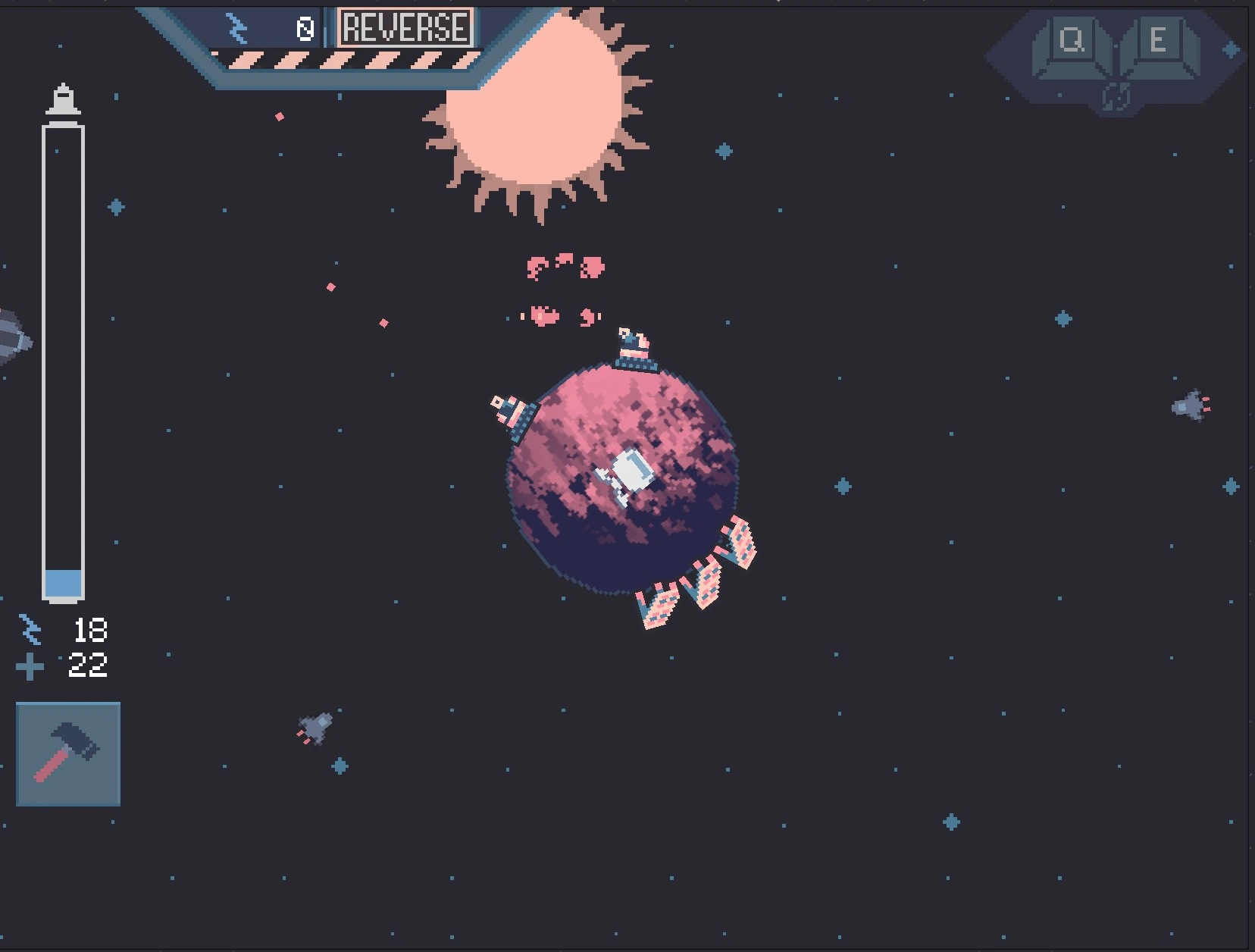
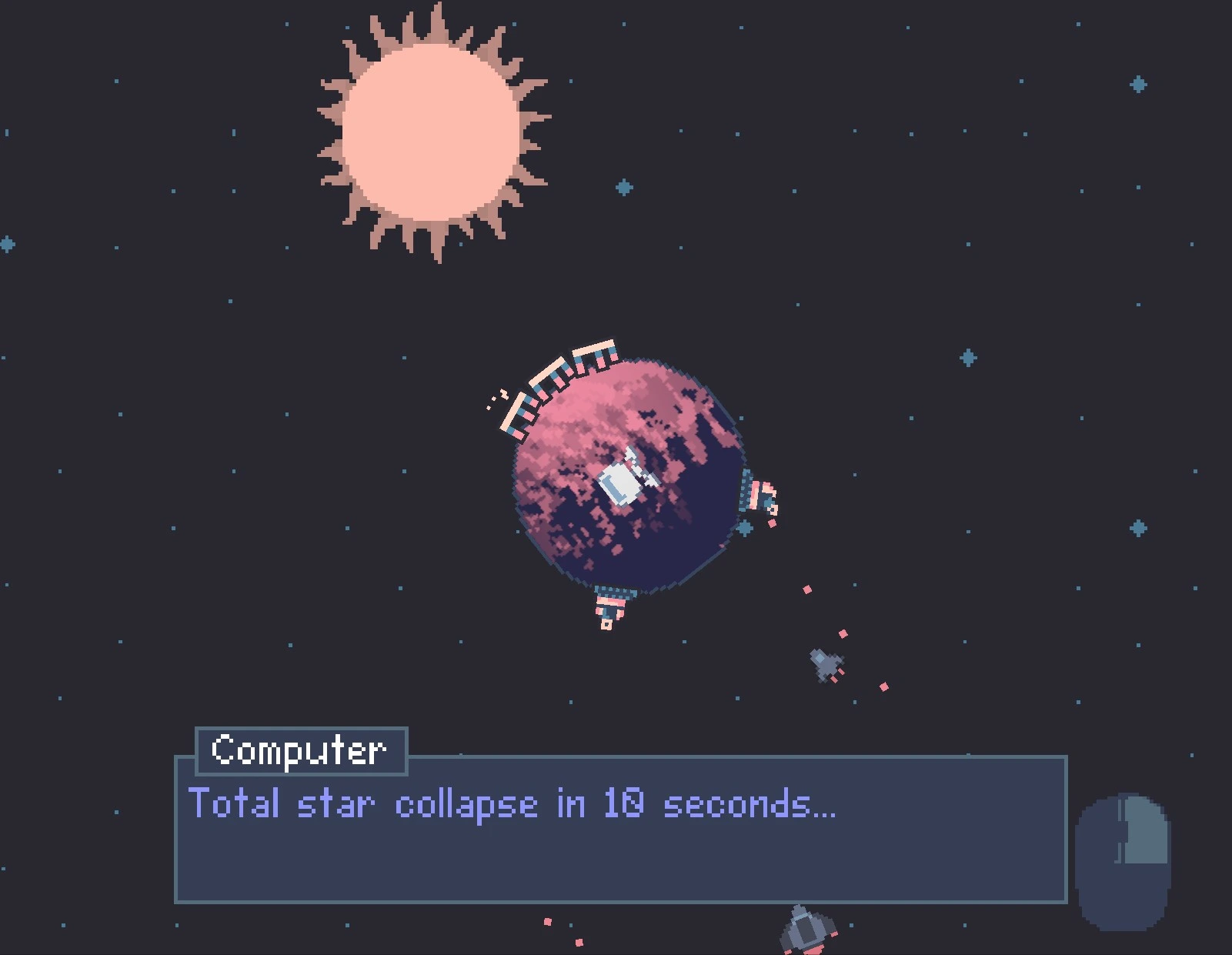
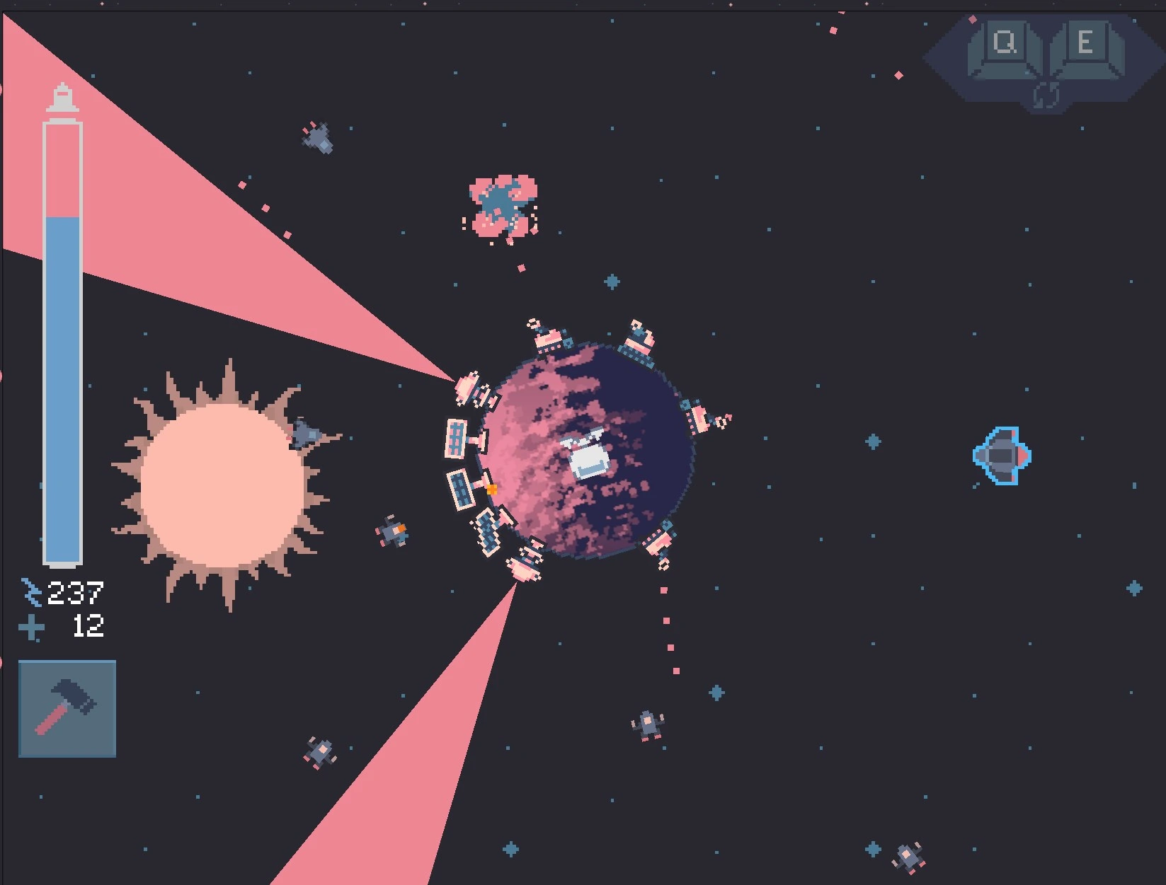
Once the theme "loop" was announced, we quickly brainstormed concepts and landed on a space tower defense game that incorporated both a time loop mechanic and visual loop gameplay. We settled on a narrative where the player had to escape a planet by building solar panels to harvest energy and turrets to defend against enemy ships before the sun exploded into a black hole, with the sun serving as a visible timer creating urgency. The core loop mechanic allowed players to rewind time before the sun's explosion to gain more attempts, but with increasing difficulty each cycle to maintain challenge and prevent infinite replays.

Research

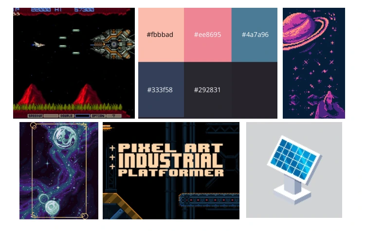
We researched vintage sci-fi pixel art styles from classic games like R-Type, Gradius, and Armored Core to establish our visual direction, then explored space-themed pixel art through Google search and Lospec to refine our aesthetic. We selected Lospec's Twilight 5 color palette for its moody, space-appropriate tones that would provide enough contrast for gameplay clarity while maintaining atmospheric cohesion. I also researched pixel art fonts that could inspire our title treatment and UI typography, ensuring readability at small sizes while matching the retro sci-fi aesthetic.

A screenshot of an 80's pixel space shooter video game.
A pixel art design of a planet in space.
Pixel Art Industrial video game typeface inspiration.
Our color palette from Lospec.

User Interviews

Pain Points

Persona

User Flow

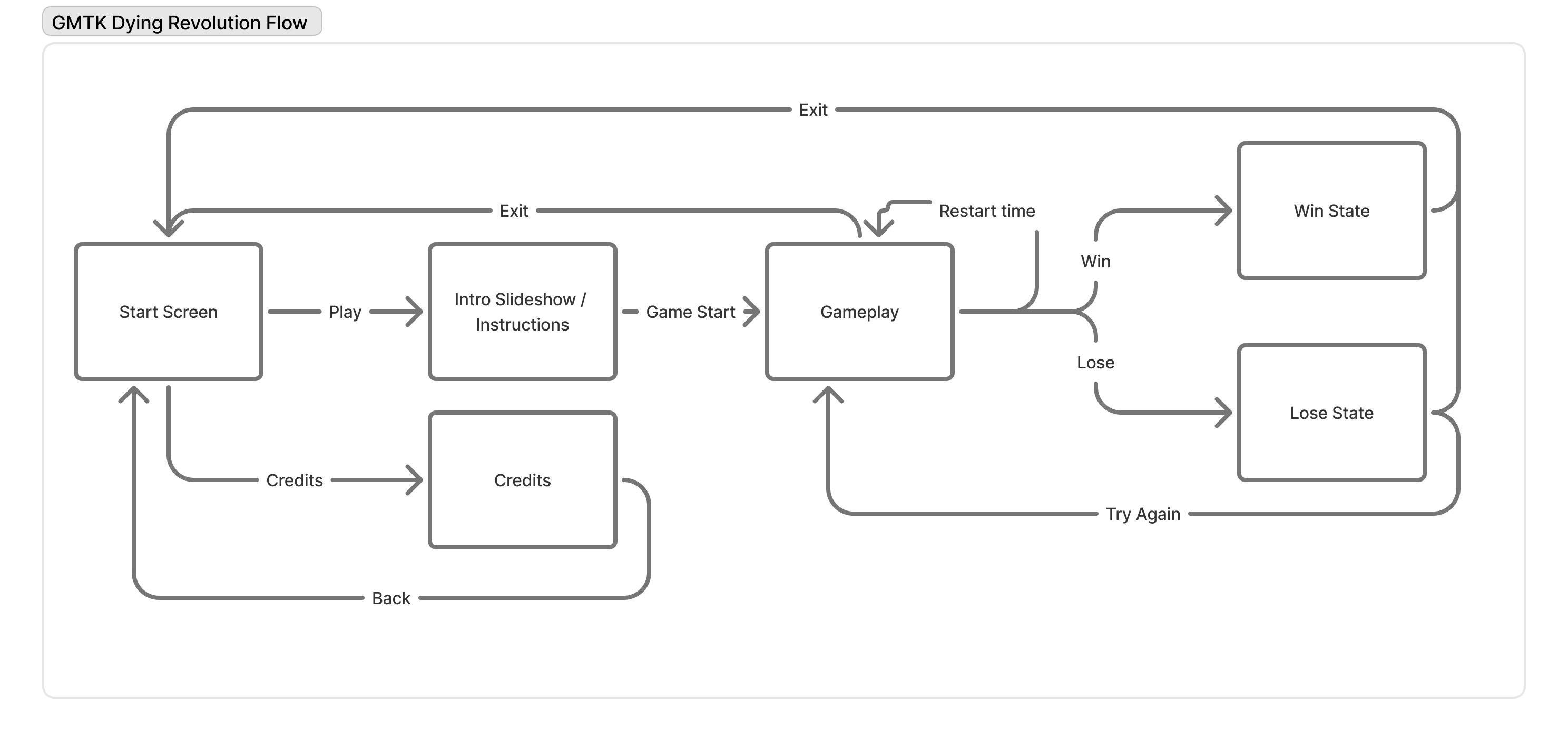
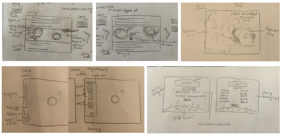
I created a user flow diagram mapping all necessary game screens including main menu, story introduction, instructions, settings, credits, and win/lose states to ensure we had a complete experience beyond just core gameplay. This documentation helped the team understand the full scope of what needed to be designed and developed within our 96-hour constraint, allowing us to prioritize which screens were essential for submission versus nice-to-have polish elements. The flow also established clear navigation pathways so players could move intuitively between menus and gameplay without confusion.

A user flow diagram showing the player's path.

Information Architecture

Storyboarding

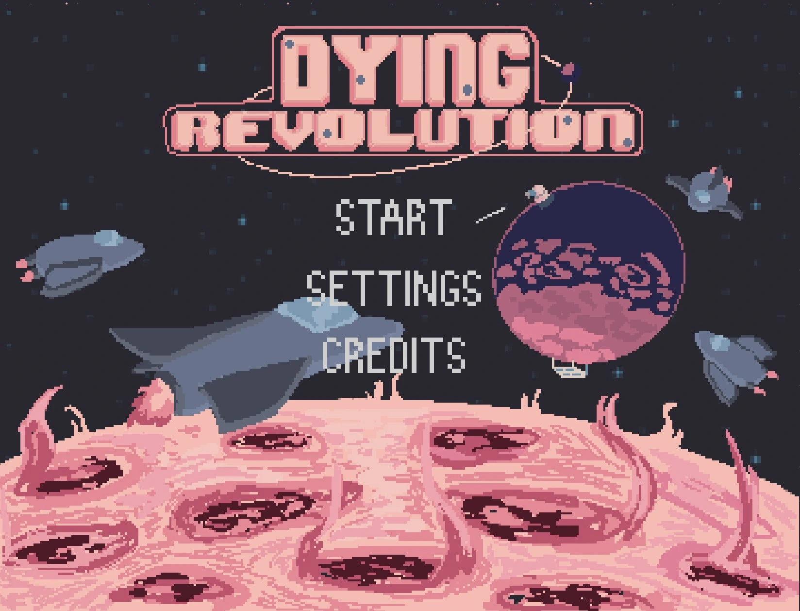
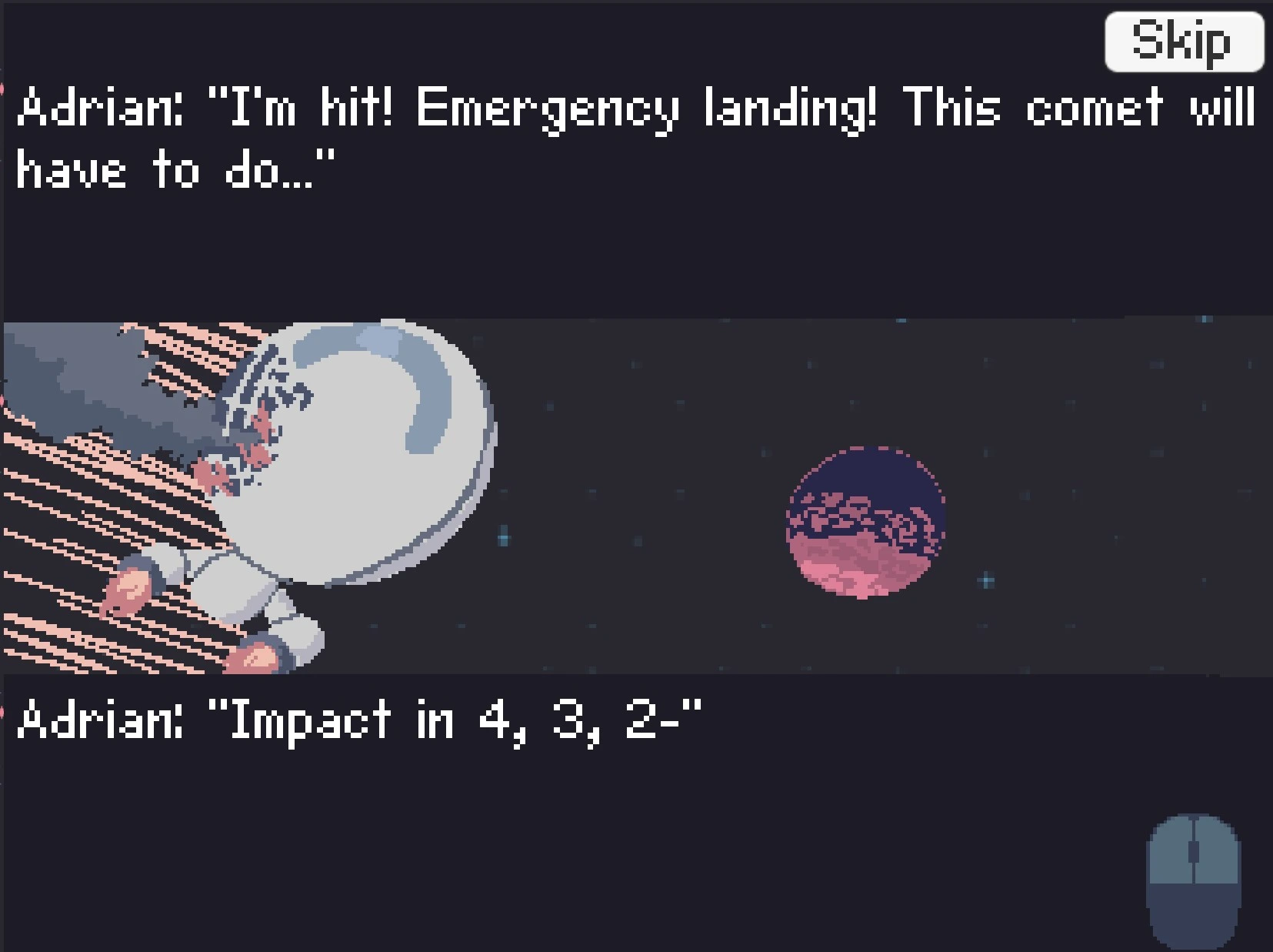
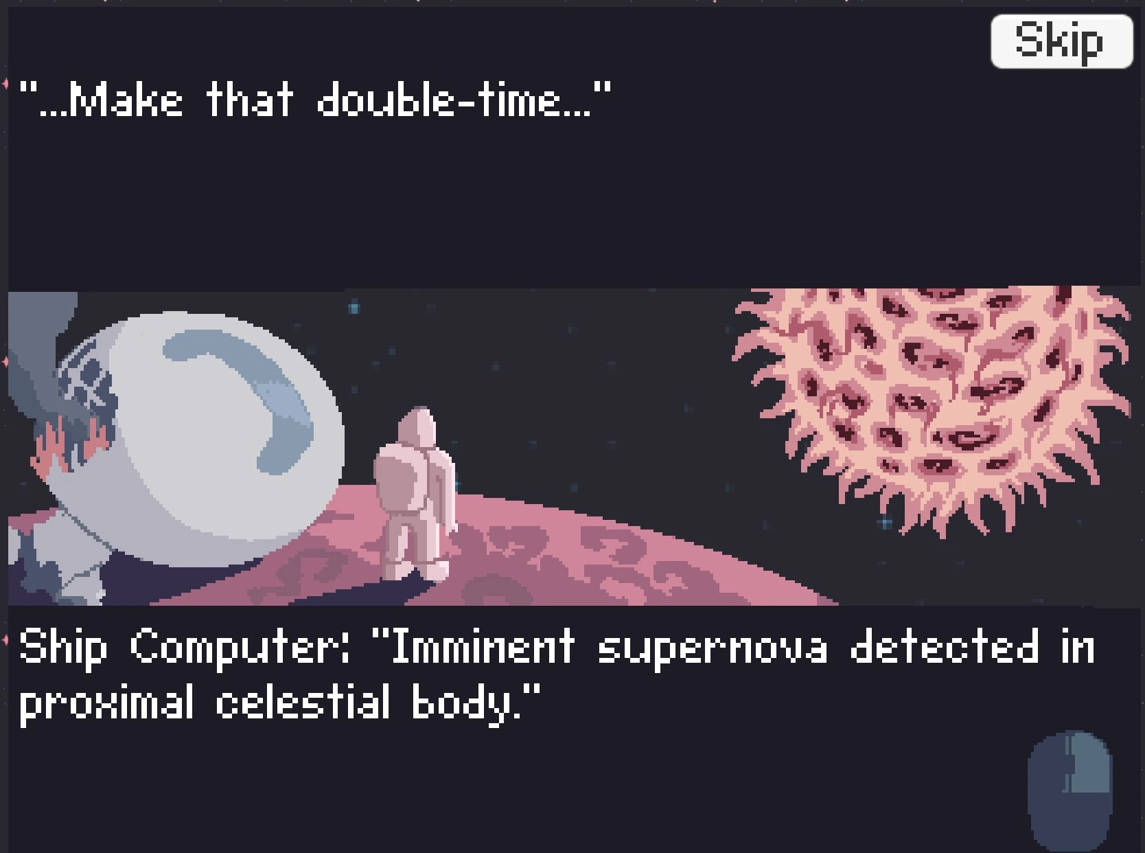
I created low fidelity storyboards for all critical screens including the main menu, story panels, game UI, build menu, settings, credits, and win/lose states to establish layout and information hierarchy before moving into pixel art production. By this stage we had named the game "Dying Revolution" and developed a narrative about the last members of a rebellion escaping their doomed planet, which informed the visual tone and text content across all screens. These sketches served as blueprints for me and the other artist to work from, ensuring visual consistency even as we divided sprite and UI work to maximize our limited timeline.

A sketch for the story, of the escape ship crashing into an asteroid.
A sketch for the story of the ship wrecked on the asteroid.
Video game UI, featuring a progress bar, energy points, a high score, and the build / store button.
The UI needed to consist of a progress bar, a measure of energy points available, the build store icon, and we considered some kind of high score element but decided against it. We also later decided to give the planet a health measurement.
The flyout build / store menu with a solar panel, a turret, and the ability to upgrade.
Sketch for the flyout menu to build solar panels, auto turrets, and upgrades.
A sketch of the Dying Revolution main menu.
Two sketches of the settings and credits page layouts.
Sketch of the game's win state, with a ship flying away from an exploded sun.

Sketches

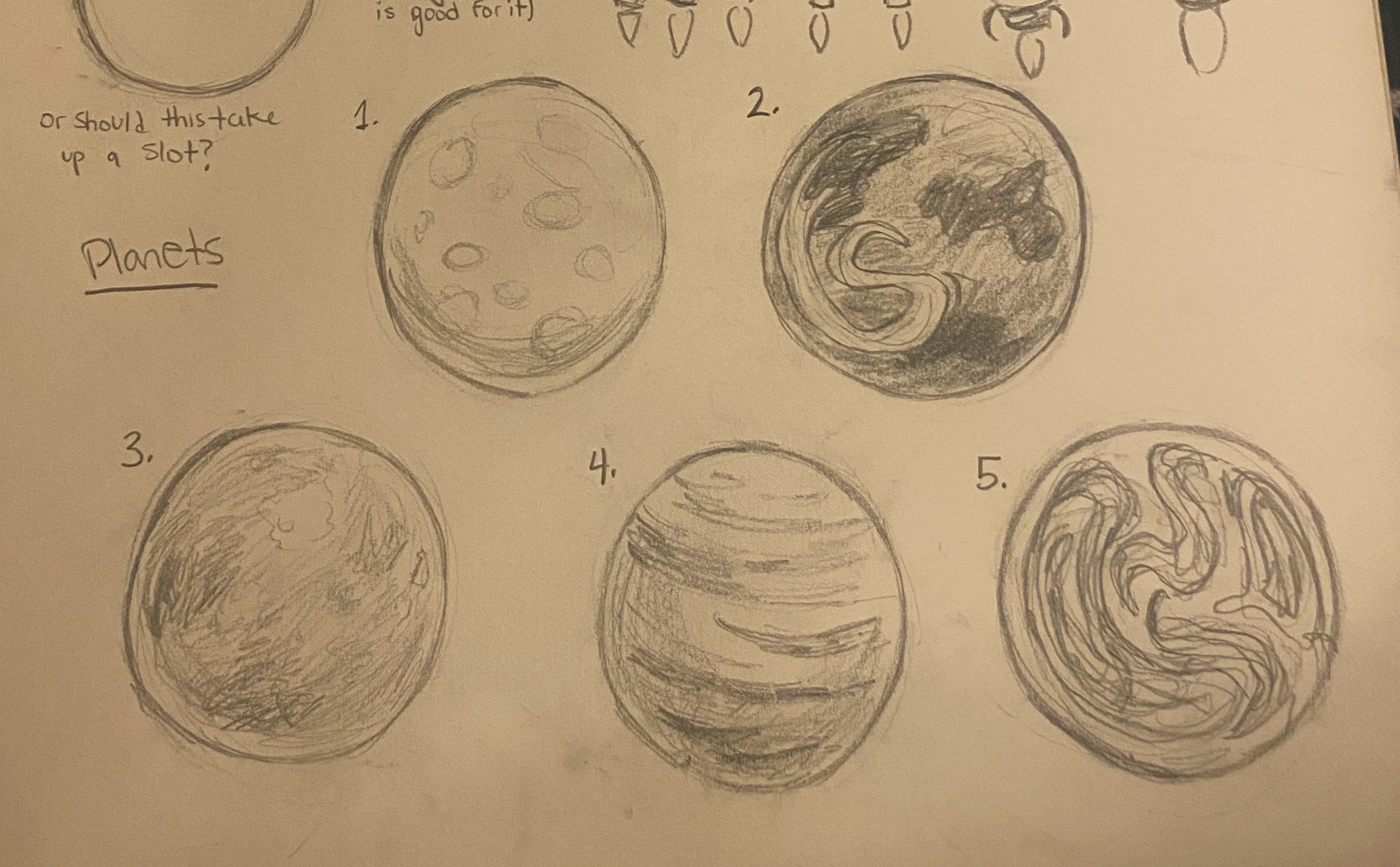
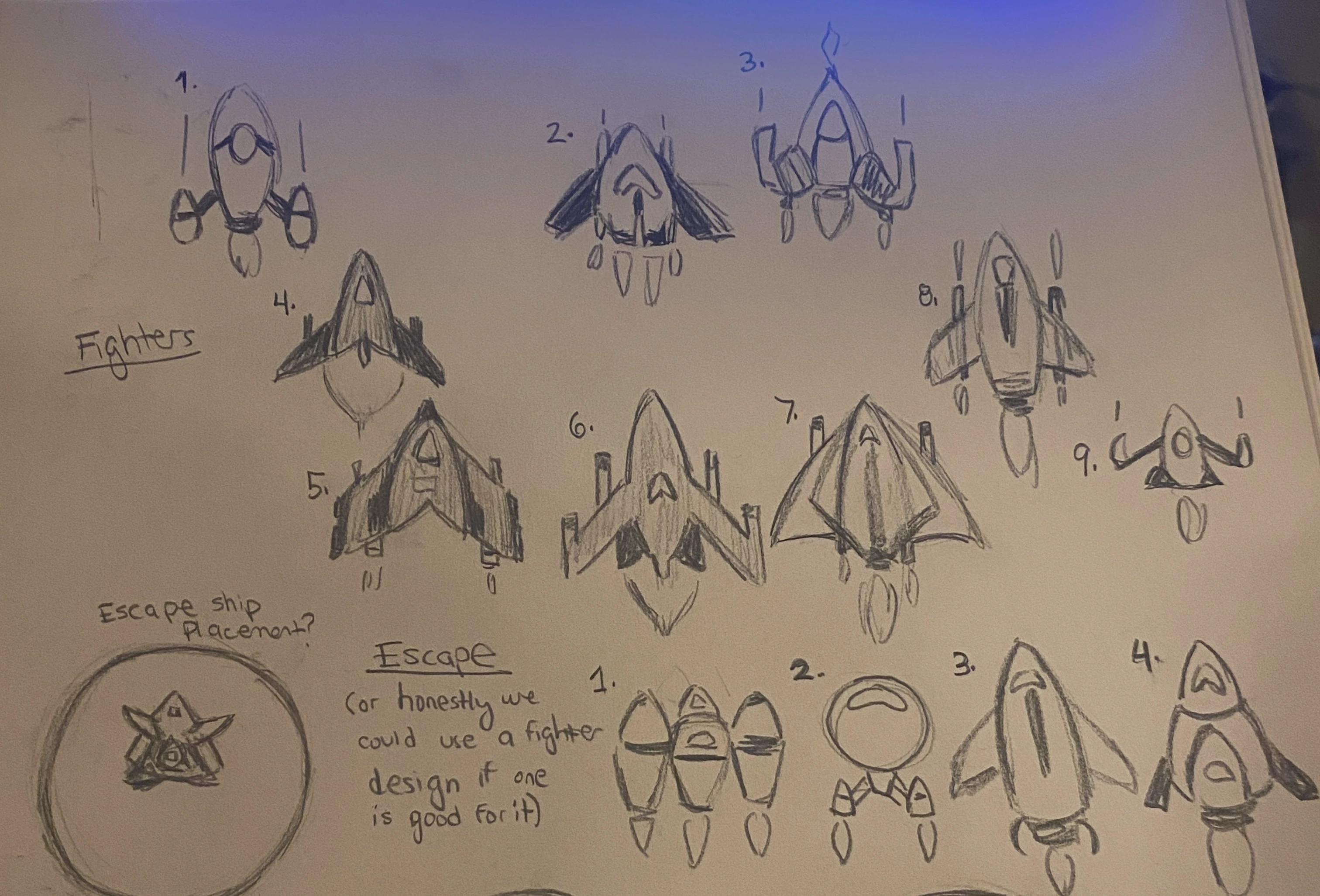
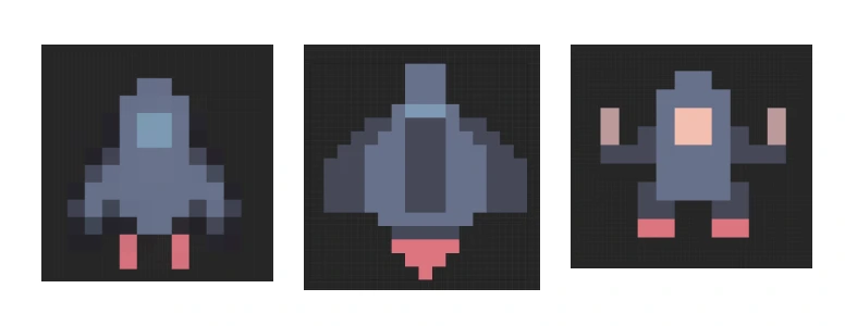
I developed concept sketches for enemy ships, the player's escape vessel, and planetary backgrounds to establish the visual language and proportions before moving into final pixel art production. These quick sketches ensured the other artist and I maintained consistent style and scale across all game assets despite working on different elements simultaneously.

Sketches for different planet designs.
Sketches for the enemy fighter ships and escape ships.

Lofi Wireframes

Lofi Prototype

Hifi Wireframes

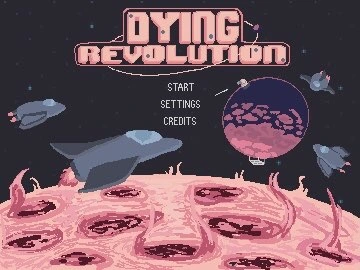
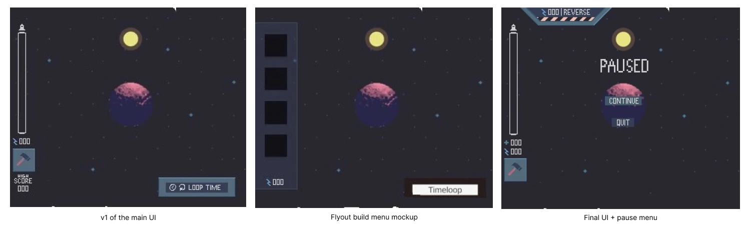
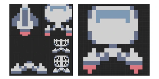
I created high fidelity pixel art wireframes and final game assets including UI screens, character sprites, and the game logo, all adhering to the Twilight 5 color palette and vintage sci-fi aesthetic we established during research. The screens below represent my contributions to the visual design, from menu interfaces to in-game UI elements that needed to communicate information clearly while maintaining the retro style. Working in parallel with the other artist allowed us to produce a cohesive visual experience across all game elements within our compressed timeline.

Main menu mockup with enemy ships shooting at the asteroid near the sun.
An animated gif of the Dying Revolution game logo with a planet orbiting it.
Logo / title design by me, animated by Cecilia
A higher fidelity version of the main UI.
v1 of the main UI
A higher fidelity version of the flyout build menu.
Flyout build menu mockup
Final version of the UI for the game, paused.
Final UI + pause menu
Three designs for the enemy ships.
Enemy ship sprites
Multiple designs and different stages of building for the escape ship.
Escape ship and unused escape ship sprites + unused building states

Hifi Prototype

Usability Testing

As our developer built out the Unity prototype with placeholder assets, we conducted rapid playtesting sessions both internally within the team and with friends and family to identify usability issues and balance the difficulty curve. This iterative testing allowed us to catch confusing mechanics, adjust timing, and refine the tutorial flow before implementing final art and audio.

Marketing

Insights

Hifi Prototype version 2

Iteration

Demo Video

Integration

Project Images

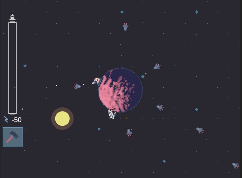
We successfully submitted Dying Revolution before the deadline with polished pixel art assets, original music and sound effects, custom lettering, and smooth animations that brought the time loop mechanics to life. The final game is available to play for free in browser at the link below, where players can experience the full tower defense loop and narrative we built in just 96 hours.

Dying Revolution game

Final design for Dying Revolution main menu.
Final design for page 1 of the story.
Final design for page 2 of the story.
Early gameplay, showing a stranded ship on a rotating asteroid with a sun revolving around it. Turrets are shooting at oncoming enemies.
Beginning gameplay
Gameplay, with a story dialogue box appearing that says "Total star collapse in 10 seconds..."
Later gameplay, with upgraded solar panels, turrets, and powerful lasers.
Later gameplay

Interactions

Accessibility Considerations

  • Designed clear visual feedback for all player actions including building placement, enemy damage, and resource collection to ensure players could understand cause and effect without relying solely on audio cues.
  • Implemented intuitive keyboard and mouse controls with a simple point-and-click interface for building placement that minimized the learning curve and didn't require complex key combinations or fast reflexes.
  • Used high-contrast UI elements and readable pixel fonts to ensure critical information like resource counts, health bars, and timer displays remained legible against the space background, even for players with visual impairments.
  • Provided clear visual indicators for the time loop mechanic so players could understand when the sun timer was critical and when they had successfully rewound time, making the core gameplay loop comprehensible without requiring audio.
  • Created a brief tutorial system that introduced mechanics gradually through on-screen text prompts, allowing players to learn at their own pace without overwhelming them with information or requiring previous tower defense experience.
  • Designed colorblind-friendly visual distinctions by varying sprite shapes and sizes for different enemy types and buildings rather than relying solely on color to communicate function or threat level.

Takeaways & Next Steps

  • Placed #75 in the Enjoyment category, proving that our core gameplay loop was intuitive, engaging, and polished enough to stand out among thousands of entries. This top 100 placement in player satisfaction validated our UX decisions around tutorial pacing, difficulty balance, and visual feedback.
  • Ranked #95 overall out of over 9,000 submissions, demonstrating that our focused design approach and efficient team coordination produced a competitive experience despite the extreme time constraints.
  • Achieved top 500 rankings across all five judging categories (Creativity, Enjoyment, Narrative, Artwork, and Audio), showing cohesive quality across disciplines and successful cross-functional collaboration despite working remotely across time zones.
  • Received overwhelmingly positive player reviews praising the game's polish, clear mechanics, and satisfying time loop implementation, with many players surprised to learn it was created in just 96 hours.

Next Steps

  • Explore post-jam development to expand on the core mechanics with additional levels, enemy types, and upgrade paths based on player feedback and ideas we didn't have time to implement during the jam.
  • Optimize performance and add quality-of-life features like additional difficulty modes, improved visual effects, and expanded tutorial content to make the experience more accessible to players unfamiliar with tower defense games.
  • Document lessons learned about rapid prototyping, remote collaboration, and designing under constraints to apply these workflows to future game jams or client projects with tight deadlines.

Here from my Gaming Design landing page? Press this button to go back!

Gaming portfolio