My goal for this project was to design and build a Shopify-integrated merchandise website for Your Friend Logan, a comedy music documentary, to support the film's premiere and create a revenue stream through branded apparel and poster sales. The project required seamless integration with Printful for print-on-demand fulfillment while capturing the quirky, lighthearted spirit of the documentary through visual design and user experience. Working in Webflow with support from a specialized developer, I needed to create an e-commerce flow that would make browsing and purchasing feel effortless while establishing a memorable brand presence that would resonate with the film's audience and encourage social sharing. The challenge was balancing playful visual elements with clear product information and a streamlined checkout process, ensuring the site converted casual browsers into buyers while maintaining the fun, approachable tone that made Your Friend Logan distinctive.
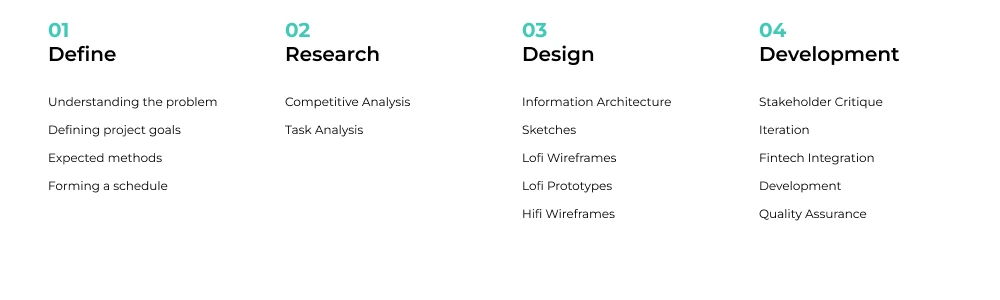
I structured the project timeline around the premiere date, beginning with a discovery phase to define business goals, map user tasks from browsing to checkout, and establish conversion metrics. I planned to conduct competitive analysis of film merchandise sites and music documentary e-commerce experiences to identify best practices for product presentation and cart flows, then move into information architecture and visual design that balanced the documentary's playful personality with clear e-commerce functionality. After stakeholder review, we would transition into development and quality assurance the week before premiere to ensure the Printful integration, payment processing, and responsive behavior were thoroughly tested before launch.
I conducted competitive analysis of documentary websites and film merchandise sites, discovering that most single-film projects existed as landing pages within larger production company sites rather than standalone e-commerce experiences. The few dedicated documentary sites I found typically included an about page, press kit, social links, and streaming options, but my task analysis revealed that achieving our core goals of merchandise conversions and driving viewership didn't require complex user flows or extensive site architecture. A critical platform decision emerged early: while Shopify offered native e-commerce tools, we chose Webflow because my developer specialized in its advanced layout capabilities and custom animation features, which would let us create the whimsical experience that matched the documentary's personality. However, we discovered the Printful to Webflow plugin had been sunset just months prior, meaning we'd need to engineer a workaround to maintain seamless print-on-demand integration.
The flow needed to be streamlined given the limited product catalog, with minimal friction between browsing and buying to capitalize on the excitement around the premiere. Critical moments included clear product imagery that conveyed the documentary's personality, transparent shipping expectations through the Printful integration, and a secure checkout process that built trust for first-time buyers unfamiliar with the film or brand.
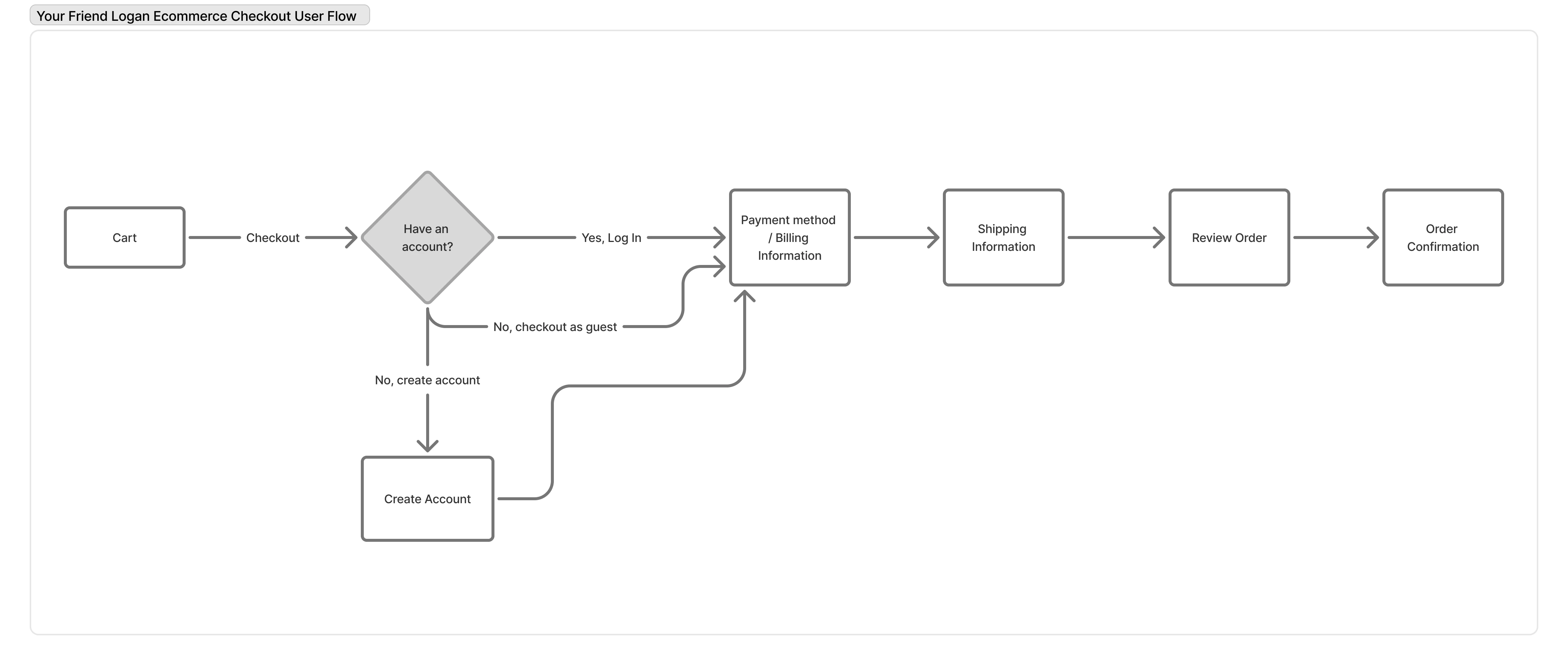
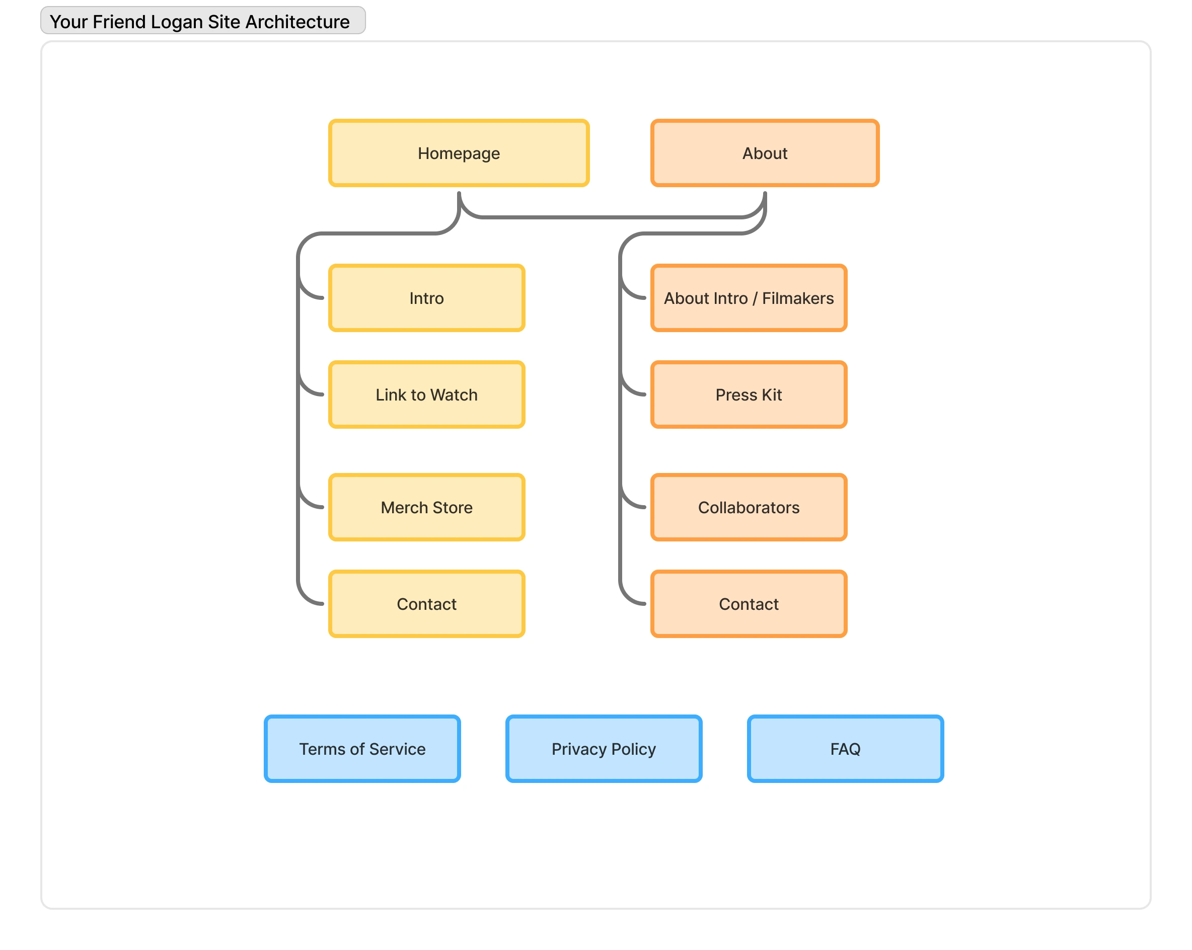
I created an information architecture diagram in Figjam that prioritized the "Shop Merch" call-to-action as the primary conversion path while organizing secondary content like where to watch, about, press kit, collaborators, and contact information with clear but lower visual prominence. Given the small site footprint, I mapped all page content directly in the diagram to ensure stakeholders understood exactly what information would appear on each page and how users would navigate between sections.
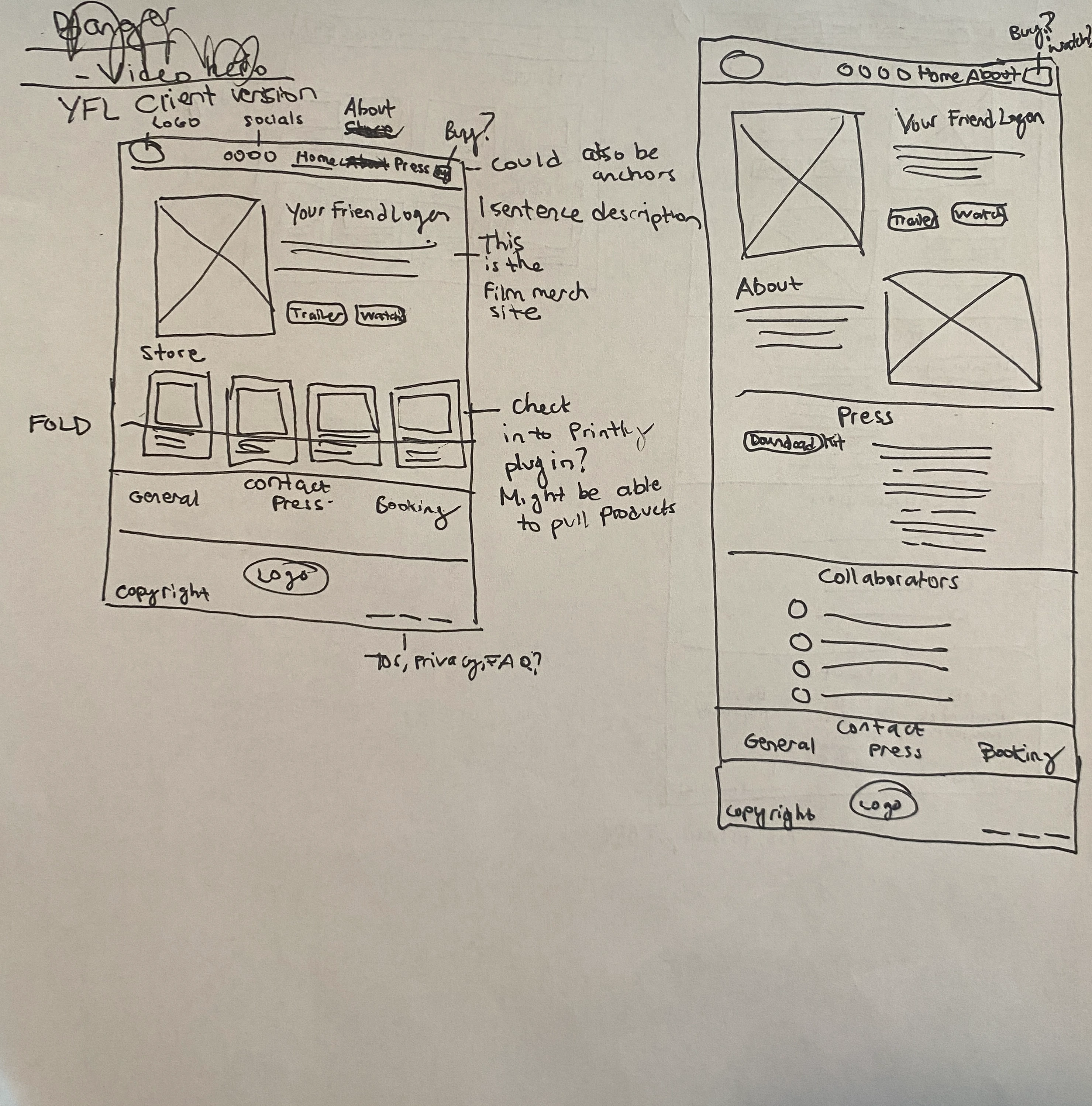
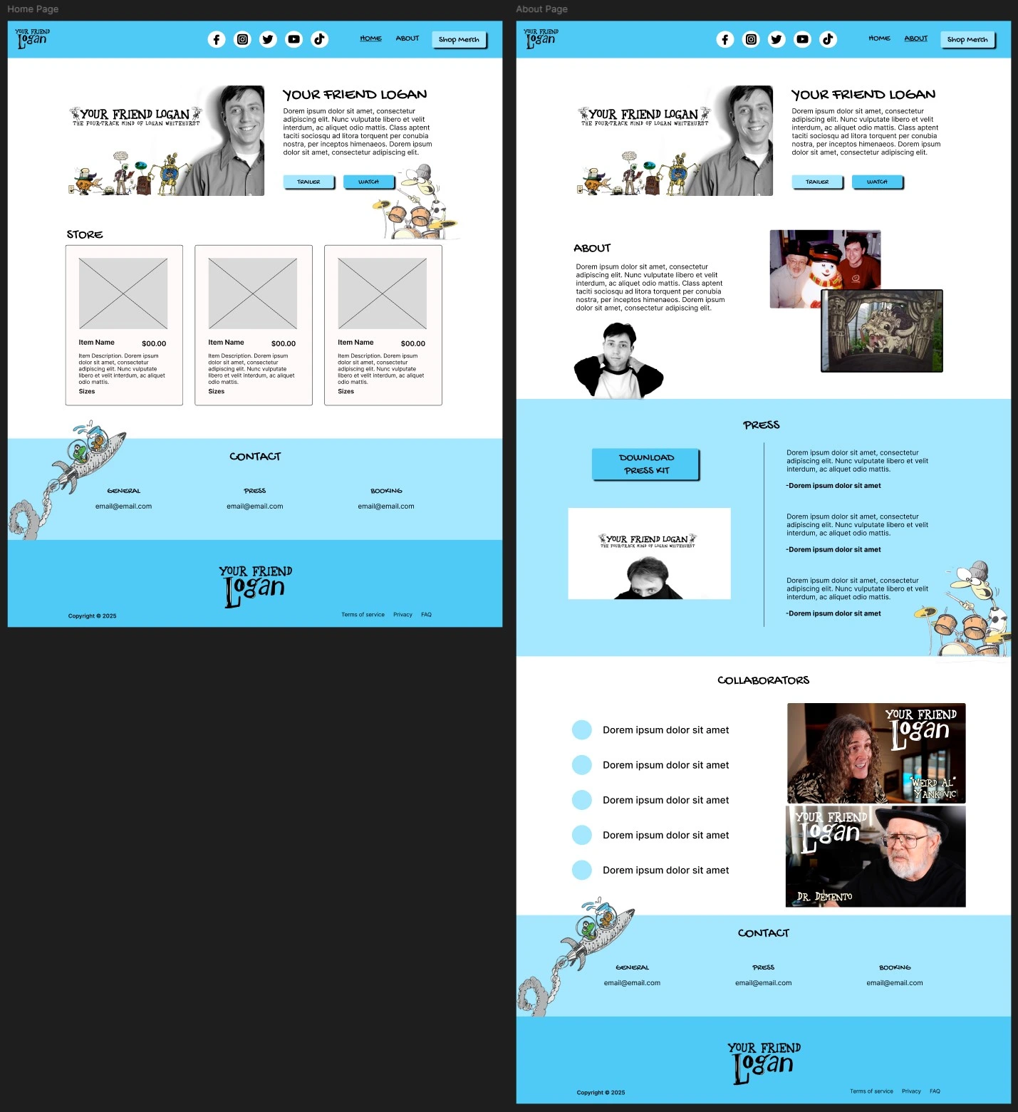
I created low fidelity sketches for the homepage and about page, primarily to communicate layout concepts with the developer and establish content hierarchy before moving into digital wireframes. The homepage prioritized the hero section identifying the site as the official merch store, the product grid, and a watch link, while the about page focused on the film description, streaming options, press kit access, and collaborator credits.
I developed low fidelity wireframes for the homepage and about page that translated the approved sketches into more detailed layouts with proper spacing, component placement, and responsive behavior considerations. These wireframes established the visual hierarchy and structural foundation that would guide both the high fidelity design phase and developer handoff.
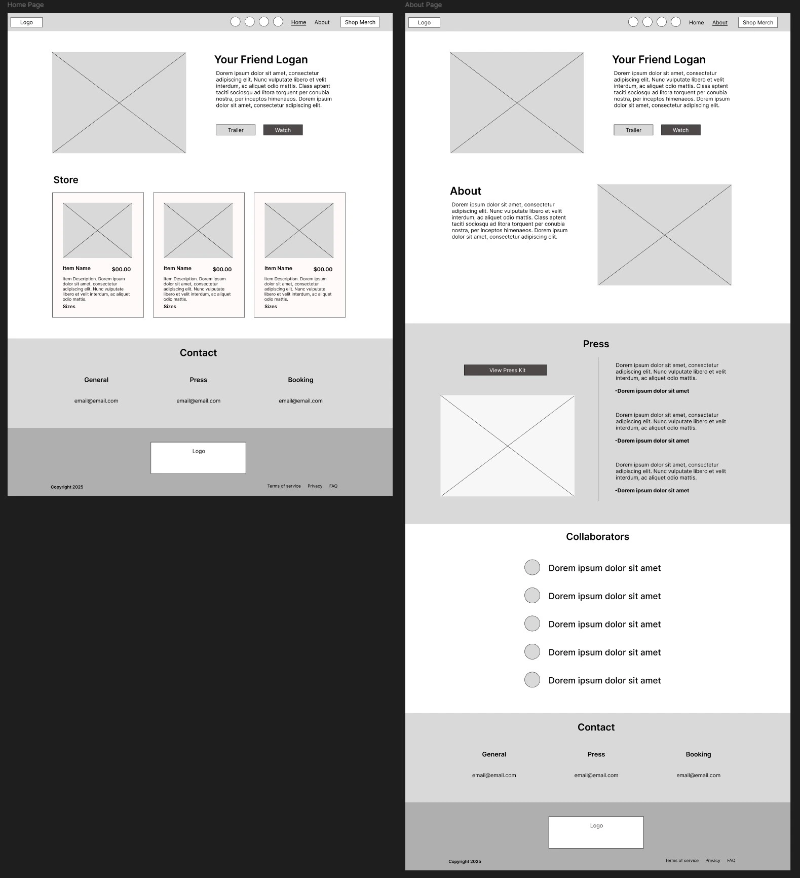
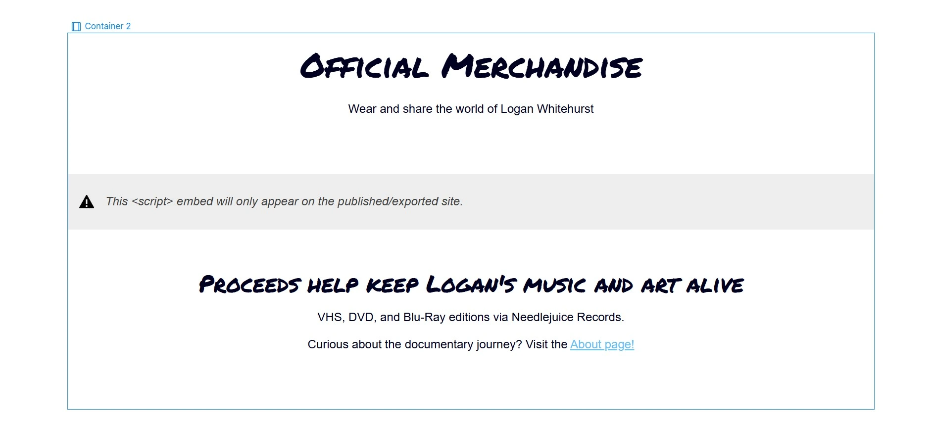
I developed high fidelity mockups that captured the documentary's whimsical, cartoony aesthetic through playful typography, the brand's signature blue color, and lighthearted visual elements. I selected a font similar to the official brand typeface for the mockups with the understanding we'd swap in the actual brand font during development for perfect consistency. The merchandise section remained in low fidelity since we planned to use a Printful to Shopify embed code or plugin for the final product display, allowing me to focus design energy on the custom branded sections like the hero, navigation, and content areas. This approach ensured the site would feel distinctly tied to Your Friend Logan's personality while maintaining functional e-commerce capabilities.
With the Printful to Webflow plugin no longer available, we discovered a workaround: integrate Printful with Shopify, then embed the Shopify storefront directly into the Webflow site to maintain our desired layout and animation capabilities. I assisted the client in configuring their Printful account to automatically populate products into Shopify, ensuring shirts and posters synced correctly with accurate pricing, variants, and fulfillment settings. Once the Shopify store was fully configured and tested, I generated the embed code that would allow seamless product display and checkout within the custom Webflow experience.
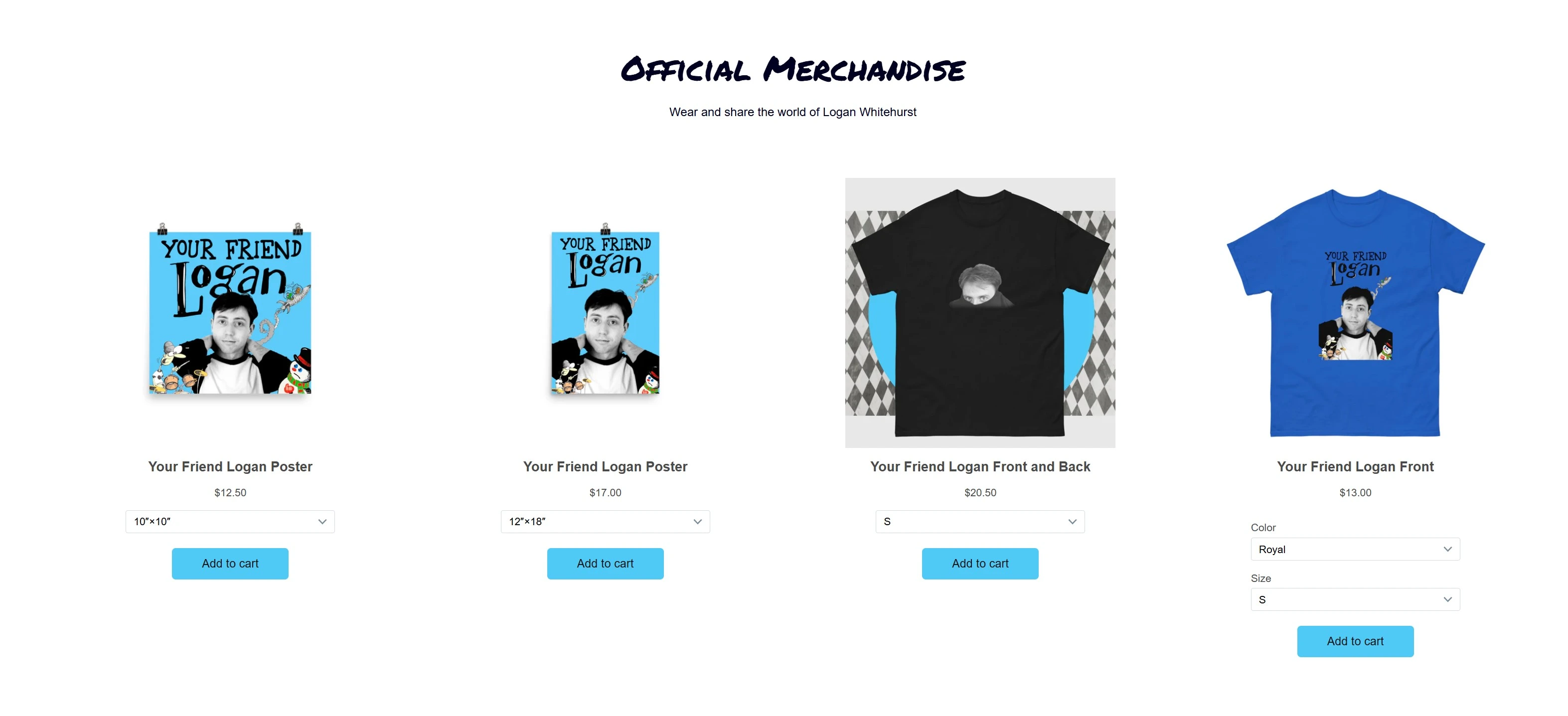
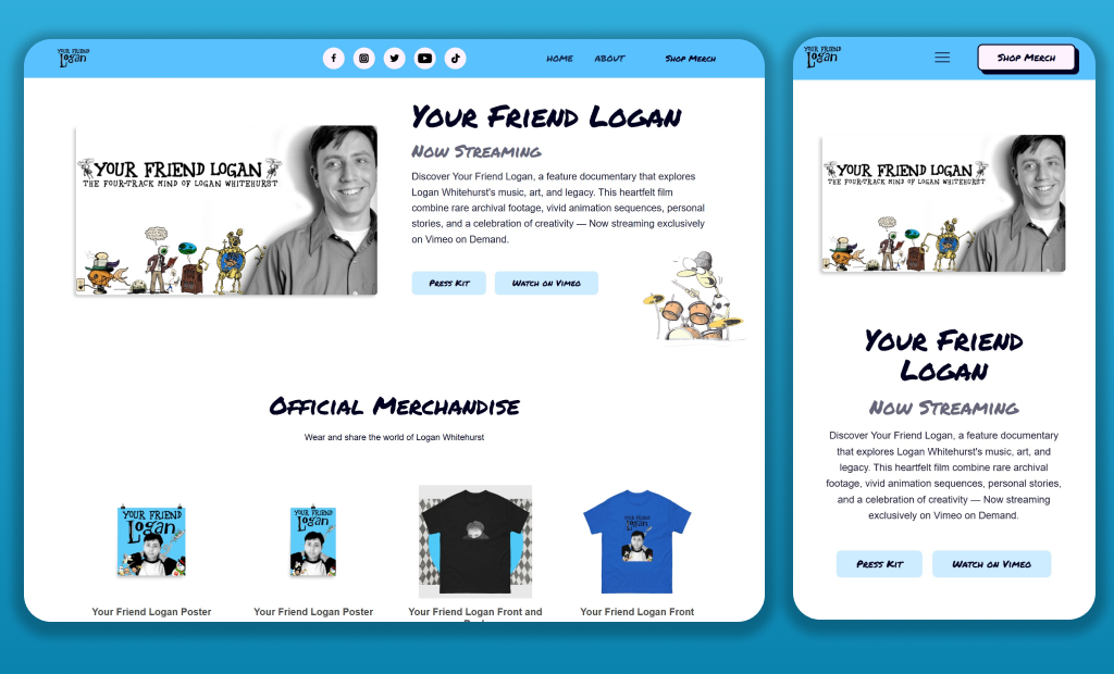
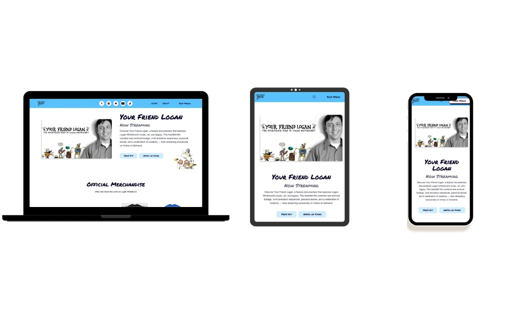
The final site successfully integrated the Shopify storefront embed that automatically populated products from Printful, creating a seamless shopping experience within the custom Webflow design. To prioritize merchandise conversions, I designed the "Shop Merch" navigation item as an anchor link that smoothly scrolls users directly to the product section rather than requiring a separate page load. The complete site with custom animations and interactions can be viewed at the link below.
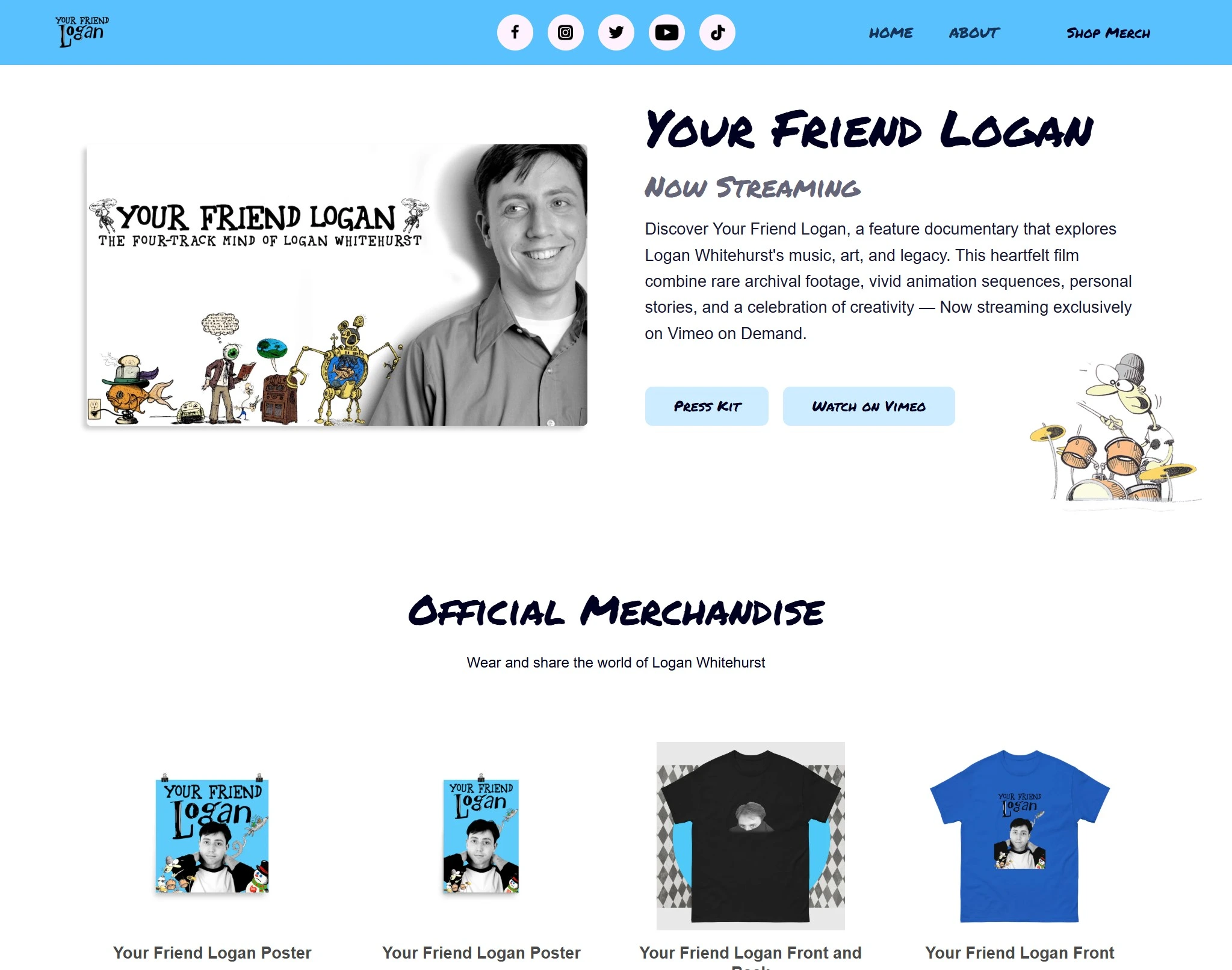
The "Shop Merch" CTA in the navigation has become an anchor that scrolls the user right to the store, to prioritize the store as the main CTA for the site.
In the contact block, Lizard and Fish’s rocket ship fades in and shoots up as the user scrolls. Elements also fade in and swipe up upon page load and many elements have hover states.
Next Steps